-as of [11 SEPTEMBER 2026]-
.
.
-INTRO-
-ROLLER COASTERS-
-TITLE BOX-
-MAKE TITLE BLEED INTO [BODY CLIP]-
-INSERT [TITLE BOX] @ [1.4 SECONDS]-
-ZOOM TO FRAME-
-ADD [MARKER] TO [1.4 SECOND] TIMESTAMP-
-IF YOUR [FRAME RATE] IS [30 FPS], MULTIPLY [30] BY YOUR TARGET [TIME DURATION]-
(BETWEEN [1 SECOND] + [2 SECONDS]-
-[30] + [0.4] = [12 FRAMES]-
-MOVE [PLAYHEAD] TO [MARKER]-
-ZOOM TO FRAME-
-THE INTRO IS [2.24 SECONDS]-
-SUBTRACT [0.6 SECOND] FROM THIS [TIME DURATION]-
-[1.64] SECONDS-
-[0.64 SECOND] = [19.2 FRAMES]-
-ADD [MARKER] TO THIS [TIMESTAMP]-
-OPEN [MARKERS PANEL]-
-[COMMAND] + [RETURN]-
-ADD [NAME/DESCRIPTION] TO MARKERS-
-TURN ON [SNAPPING] IN [TIMELINE]-
-[OPTION-DRAG] MARKER TO THE NEXT MARKER-
-THIS CREATES A “RANGE MARKER” WHICH DISPLAYS [NAME/DESCRIPTION]-
-ADD MARKER @ 0.85 SECOND MARK OF BODY CLIP-
-[25.5] FRAMES-
-[40,800] SAMPLES-
-TO DO THIS, FIRST MOVE [PLAYHEAD] TO BEGINNING OF [BODY CLIP]-
-CLICK THE [TIMECODE BOX]-
-TYPE IN [+40800]-
-HIT [RETURN]-
-ADD MARKER-
.
-CREATE MANUAL [CROSS DISSOLVE]-
-BALLOONS FADE OUT AS TITLE FADES IN-
-BRIEF OVERLAP-
.
-USE MANUAL OPACITY KEYFRAMES ON TITLE GRAPHIC-
-AND ON [BALLLOON ELEMENTS] (IF NOT BAKED IN)-
-IF “BAKED IN”, MANUAL OPACITY KEYFRAMES ON ENTIRE “INTRO”-
-TITLE BOX GOES FROM [INVISIBLE] TO [VISIBLE] OVER [8 FRAMES]-
-BOTH [BALLOON] + [TITLE BOX] ARE VISIBLE AFTER [4 FRAMES]-
-BY [8 FRAMES], [BALLOONS] ARE [INVISIBLE] + [TITLE BOX] IS [VISIBLE]-
-TITLE BOX SHOULD ALSO HAVE [SCALE/WIDTH] EXPANSION-
-IF YOU CAN’T ISOLATE THE BALLOONS, LEAVE “INTRO” AS IS-
-USE “BALLOON POSITION” AS ROUGH ANCHOR FOR RECTANGLE-
.
-CREATE MARKER WHERE TITLE BEGINS TO FADE OUT-
-9 FRAMES ATER “BODY START”-
.
-CREATE TOTAL BOX WHERE [FACE/BALLOON] OVERLAP
-HIGHER THAN DEAD CENTER-
-3 ROWS-
LYRICS
TITLE
PERFORMER
.
-TO INSERT TITLE OVERLAY-
-TIMELINE-
-MOVE PLAYHEAD TO [TITLE ENTER-
-SELECT TYPE TOOL-
-CLICK INTO [PROGRAM MONITOR]-
TYPE IN “STOP MOTION”-
-PRESS [ESCAPE]-
-SWITCH TO [SELECTION TOOL]-
CLICK DRAG SO THE BOX IS IN THE FRAME
(IT IS INSERTED AS A GRAPHIC IN V5 (ABOVE THE CAPTIONS)
-CLICK THE TITLE BOX IN “PROGRAM MONITOR TO SELECT IT
-PROPERTIES PANEL-
-[OPTION] + [CONTROL] + [ p ]-
-[1080] + [1920]-
*frame center* –>
-[540] / [960]-
-IN [ALIGH/TRANSFORM], CLICK “ALIGN CENTER HORIZONTALLY” + “ALIGN CENTER VERTICALLY”
-SELECT “RECTANGLE TOOL”-
-DRAW RECTANGLE IN THE “PROGRAM MONITOR”
-RENAME IT “TITLE BOX”-
-DRAG THE “TITLE BOX” BELOW THE “TEXT BOX” IN “PROPERTIES PANEL” SO THAT THE TEXT IS VISIBLE IN FRONT OF THE BOX-
-RESIZE THE RECTANGLE AROUND THE TEXT BOX
-ALIGN CENTER VERTICALLY + HORIZONTALLY
-SELECT THE RECTANGLE IN “PROPERTIES PANEL”-
-SCROLL DOWN TO “RESPONSIVE DESIGN” DROPDOWN MENU-
-SELECT “PIN TO” STOP MOTION-
-CLICK ALL 4 SIDES IN THE RIGHT “FRAME GRAPHIC” TO PIN ALL 4 SIDES-
-SELECT ONLY THE “TEXT BOX” IN “PROPERTIES PANEL”-
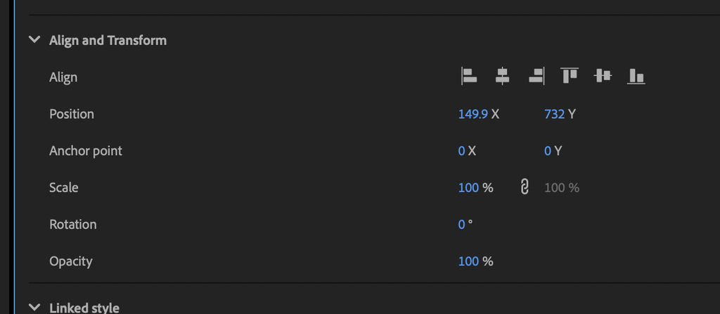
-ALIGN/TRANSFORM-
-POSITION-
-Y COORDINATE-
-INPUT “820”-
-HIT [RETURN]-
-NAVIGATE TO “PROGRAM MONITOR”-
*TO MOVE [UP/DOWN] BY 1 UNIT* –?
-COMMAND [UP/DOWN]-
*TO MOVE [UP/DOWN] BY 5 UNITS* —>
-SHIFT / COMMAND / [UP/DOWN]-
.
-HIDE “BODY OVERLAY”-
-MOVE PLAYHEAD TO MARKERS WITH BOTH THE “INTRO CLIP” + “BODY CLIP”
.
-SELECT ONLY THE RECTANGLE IN “PROPERTIES PANEL”-
-NAVIGATE TO “PROGRAM MONITOR”
“SELECTOR TOOL”
ADJUST HEIGHT/WIDTH WITH THE MIDDLE HANDLES ON EACH SIDE
-GO FULL SCREEN + ZOOM TO 200% FOR MORE PRECISE RE-SIZING
SLIGHTLY INCREASE HEIGHT
RETURN TO “FIT” ZOOM
SHIFT + COMMAND + ZERO
ADJUST ALL 4 SIDES
TO RECENTER, SELECT BOTH GRAFIX IN PROERTIES PANEL, ALIGN TO SELECTION
-THEN ALIGN TO CENTER HORIZONTALLY / VERTICALLY
THEN YOU HAVE TO REAPPPLY “RESPONSIE DESIGN
.
TO TEST THE BOX, DOUBLE CLICK THE TEXT BOX IN PROPERTIES PANEL, TYPE IN A LONGER NAMEAND THEN CLICK OUT OF THE BOX
TO RECENTER THE TEXT BOX, CLICK ONLY THE TEXT BOX IN PROPERTIES PANEL AND ALIGN TO CENTER ORIONTALY
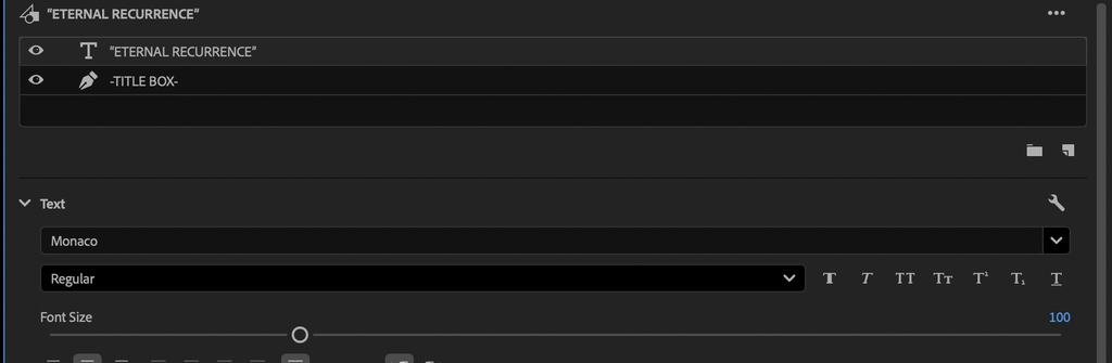
-DEFAULT “FONT SIZE” IS 100-
IF THAT IS TOO BIG TO FIT TO FRAME, LOWER THE FONT SIZE
.
-TRACK TARGET V5
COMMAND + 5
-SELECT THE TITLE BOX
d
-MOVE PLAYHEAD TO THE “TITLE END” MARKER
to move title box end to palyhead
SHIFT + W
MOVE PLAYHEAD TO TITLE BEGINNING IN TIMELINE
EFFECT CONTROLS
-OPACITY-
-MOVE OPACITY SLIDER TO [0]-
CLICK STOPWATCH TO ENABLE ANIMATION
-A KEYFRAME IS AUTOMATICALLY CREATED AS SOON AS YOU ENABLE ANIMATION-
-MOVE PLAYHEAD TO NEXT MARKER
ADD KEYFRAME
SET OPACITY SLIDER TO 100
MOVE PLAYHEAD THE THE TITLE FADEOUT MARKER
ADD KEYGRAME
(KEEP OPACITY AT 100)
-MOVE PLAYHEAD TO “TITLE END” MARKER
ADD KEYFRAME
SET OPACITY TO 0
.
-BALLOON EXIT MARKER
-THE GRAY RECTANGLE BECOMES PRIMARY OBJECT, NOT THE BALLOON
.
-MOVE PLAYHEAD TO “BALLOON EXIT” MARKER-
.
*TURN ON “SNAP IN PROGRAM MONITOR”* –>
OPTION + CONTROL + s
.
drag left/right/top until they snap
.
-AT “BALLOON EXIT” FRAME-
-PROPERTIES PANEL
-SELECT “TITLE BOX”-
“ALIGN/TRANSFORM”
.
*make sure horizontal/vertical scale are unlinked* –>

.
-THE 1ST BOX IS VERTICAL SCALE-
-THE 2ND BOX IS HORIZONTAL SCALE-
.
-ADD KEYFRAME-
.
-NAVIGATE TO TIMELINE-
-MOVE PLAYHEAD BACK. TO “TITLE ENTER” MARKER-
-CHANGE HORIZONTAL SCALE TO 15%
(A KEYFRAME IS AUTOMATICALLY ADDED)
.
-MAKE THE TEXT BOX VISIBLE AGAIN-
-SELECT ONLY TEXT LAYER IN PROPERTIES PANEL
.
*TITLE ENTER** —>
RECTANGLE ENTER
.
does the expanding gray band convincingly overwhelm the baked balloons?
does the delayed lettering feel like it is resolving from the band?
when BODY ENTER happens underneath it, does the title remain readable without covering the important part of your face?
.
-PROPERTIES PANEL
-SELECT “TITLE BOX”
.
🙏 yes — after looking at the actual export, I think your instinct is right: the title is hanging over the body longer than it needs to
In the current clip, the sequence is roughly:
~1.5 s — title transformation becomes visible
~1.7 s — STOP MOTION is essentially fully readable
~2.4–2.5 s — body first starts emerging from black
~2.6 s — your face/body is clearly perceptible
~3.0–3.1 s — title finally disappears
~3.3 s — swallowing a pill… begins appearing
So you currently have a fairly long period around 2.6–3.0 where the title is sitting directly over an increasingly readable performance frame.
I think that’s the part to remove.
I’d change the timing to this
Keep the entire entrance exactly as you’ve built it.
Then:
BODY ENTER / first hint of body from black
→ begin title fade-out
~8–10 frames later
→ title completely gone
That would probably put the title fully out around 2.65–2.75 s in this particular export.
Then you get:
balloons → dramatic isolated title → body starts materializing → title dissolves → clean performer → first caption
That is cleaner than having title + performer + caption operate as three simultaneous visual layers.
And I especially like what you said about the memory of the title position. Because the title has just occupied that upper-middle band very dramatically against black, it doesn’t need to remain there once your face appears. The viewer has already registered that spatial relationship.
Then when:
swallowing a pill…
appears higher up around 3.3 s, it feels like the graphic vocabulary has handed control from:
song identity → lyric information
rather than stacking them.
is that enough title-reading time?
For STOP MOTION, yes.
Even with the shortened exit, you’d have roughly:
~0.2 s of the box/text resolving
~0.7–0.9 s of extremely clean full readability
~0.3 s fade-out
so around 1.2 seconds of perceptual title presence, with much of it being the single most prominent thing in the frame.
That’s plenty for a short two-word title.
I’d make one qualification for the template: don’t force this exact hold duration on unusually long titles.
Something like:
ETERNAL RECURRENCE
may benefit from another 6–10 frames of fully readable hold before fading. You’ve already created a title-size fallback, so timing can have a similar deterministic fallback:
normal title → baseline hold
long title → +~0.25 sec hold
No need to redesign anything.
for the color: yes, use the eyedropper
Select TITLE BOX → Properties → Appearance → Fill, click the color swatch, then use the eyedropper to sample a color from the visible frame.
That is actually how I’d experiment here rather than choosing colors abstractly.
A useful approach would be to sample:
the muted blue/gray sky
a darker shade from the coaster structure
a desaturated tone from one of the balloons
then compare each at your existing 85% title-box opacity.
Because you’re sampling directly from the source image, the band is more likely to feel like it condensed out of the footage rather than like an unrelated graphic pasted over it.
But your existing neutral gray is already serviceable. I’d treat color as an optional branch, not something that needs fixing.
I’d make this your new baseline timing
TITLE ENTER → expansion + delayed lettering
TITLE FULL → short isolated hold
BODY ENTER → TITLE FADE OUT begins
BODY VISIBLE → TITLE completely gone
short clean-body interval
CAPTION ENTER
Having watched this actual export, I prefer that hierarchy quite a bit over the current longer overlap.
It also gives you a stronger standardized rule going forward:
the title belongs to the threshold between bookend and body — it doesn’t belong inside the body itself
which seems particularly well matched to what you’re building here.
.
🙏 next I’d treat the motion as locked and move to a very small appearance pass—one variable at a time so you don’t accidentally “improve” away what already works.
First, duplicate this sequence and mark the current one in Comments as something like APPROVED MOTION — horizontal band + delayed text + fade exit. That gives you a permanent checkpoint.
Then in the duplicate, change only the TITLE BOX fill. Don’t touch position, dimensions, timing, or text animation. I’d compare three states:
current gray at 100% — your control
same gray at roughly 90–95% opacity
slightly darker gray at 100%
Because the band’s job here is partly to occlude the baked balloons, I wouldn’t go very transparent; once you start seeing all four balloons clearly through it, the transformation illusion weakens.
After that, watch it at Fit, not 100–200%, and judge only: does the band feel like part of the roller-coaster image or like a generic UI rectangle?
If the current gray already feels right, keep it. No need to manufacture another design problem.
Then I’d do exactly one motion-polish test: compare the current Linear horizontal expansion against a gentle Ease Out on the final width keyframe. If Linear feels deliberate and mechanical—which may actually suit the STOP MOTION vocabulary—keep Linear. I would not add easing just because it exists.
Once appearance is settled, the 9:16 title system is essentially finished. Then the cleanup/standardization pass is:
remove the onion-skin helper → restore clean track naming → rename the approved graphic something like -TITLE BAND- [9×16] → keep it in the skeleton sequence → duplicate/adapt it for the 16:9 skeleton
And for 16:9, I would recompose the band rather than blindly scaling the 9:16 version: same entrance timing and animation logic, but establish a new vertical title lane and full-width end-state appropriate to 1920×1080.
So the immediate next click is: duplicate approved V5 → select TITLE BOX → test fill/opacity only.
🙏 good — now I’d stop building the entrance and test the complete handoff into the body before adding any more animation.
From where you are:
turn the real body clip back on and hide/delete the temporary onion-skin frame
go to BALLOON EXIT / TITLE 100 and confirm:
rectangle = full width
text = 100%
leave both completely unchanged through BODY ENTER
at BODY ENTER, let only the background change from roller coaster → performance
keep the full title visible until TITLE FADE OUT
use the existing whole-graphic opacity fade from TITLE FADE OUT → TITLE END
So the finished logic is:
TITLE ENTER
rectangle begins narrow / text 0%
→
mid-enter
rectangle expanding / text begins appearing
→
BALLOON EXIT
rectangle full width / text 100%
→ hold
BODY ENTER
background changes, title stays untouched
→ short hold
TITLE FADE OUT
whole title graphic begins fading
→
TITLE END
whole graphic 0%
I would not animate the rectangle shrinking on exit
For this first version, let the entrance be the special event and make the exit a simple fade.
That gives the sequence a directional grammar:
balloons generate title → title establishes song → performance takes over
rather than making the title appear to reverse itself.
playback test
Watch roughly 01:05 → 02:25 several times at normal speed, not frame-by-frame.
The three things to judge are:
If those work, I’d call the motion geometry finished.
Then the next pass is aesthetic rather than structural: gray-band opacity/color + possibly easing the expansion. I’d leave both alone until you’ve watched the completed body handoff, because the current plain linear/gray version gives us a clean baseline.
🙏 good — that screenshot is exactly what we wanted: the height stays fixed and the band expands horizontally from the center. At 01:16 you’re around 66% width, and it already reads like the balloons are being swallowed by a horizontal plane.
Next step is to make the text arrive slightly after the rectangle, rather than appearing at the same time.
First, turn the “STOP MOTION” layer back on. Then select only the text layer in Properties and animate its layer Opacity:
01:12 TITLE ENTER → 0%
around 01:15–01:16 → 0%
01:19 BALLOON EXIT → 100%
I’d use 01:16 first because your screenshot shows the rectangle is already ~66% expanded there. That gives a nice sequence:
01:12 — narrow gray seed, no text
01:16 — band already mostly formed, text begins appearing
01:19 — full-width band + fully readable title
So visually:
balloons → expanding band → letters resolve → finished title
One cleanup before you judge it: your timeline screenshot still appears to show the whole purple title graphic’s original 0→100 opacity ramp. For this version, I’d flatten the entrance portion of the whole graphic clip to 100% throughout, otherwise you’re simultaneously fading the rectangle while expanding it.
Keep the existing whole-graphic exit fade later. So clip-level opacity becomes:
100% ───────────────── 100% → 0%
while the internal animations do the entrance:
TITLE BOX width: 15% → 106%
TEXT opacity: 0% hold → 100%
That separation is cleaner:
box geometry creates the entrance
text opacity creates the reveal
whole graphic opacity handles the exit
I’d duplicate this working sequence once more before flattening that entrance opacity, since you’ve now got a good documented horizontal-expansion branch. Then make the delayed-text version the next experiment.
In the Properties layer list, click TITLE BOX only — not the text and not the overall graphic.
Open its Align and Transform controls.
Make sure horizontal and vertical Scale are unlinked.
At BALLOON EXIT, add a keyframe for the rectangle’s horizontal Scale = 100%. Leave vertical Scale = 100%.
Move back exactly to the left edge of TITLE ENTER.
Set only horizontal Scale to about 15% as the first test. Keep vertical at 100%.
So the rectangle animation becomes:
TITLE ENTER: X 15% / Y 100%
→
BALLOON EXIT: X 100% / Y 100%
The rectangle should stay the same height and spread sideways.
the only thing to inspect before continuing
Scrub those seven-ish frames and see where the expansion originates.
You want:
← ← ← ▬ → → →
with the left and right edges moving away from the yellow balloon at approximately equal rates.
If it expands mainly toward one side, don’t compensate by changing Position. That means the TITLE BOX layer’s Anchor Point isn’t centered in the rectangle, and we should fix that first.
Given that you centered the rectangle against the text before doing the final pinning, there’s a decent chance it will already expand correctly.
temporarily keep the text out of the equation
For this test, I’d actually hide the STOP MOTION text layer with its eyeball icon.
Then you can see nothing but:
baked balloons → narrow gray seed → full-width gray band
That makes it much easier to judge whether the transformation itself works.
Once the band expansion looks right, turn the text back on and we’ll give the letters their delayed opacity entrance so they resolve after the band has started swallowing the balloons.
So the immediate move is:
hide text → select TITLE BOX → 100% X Scale @ BALLOON EXIT → ~15% X Scale @ TITLE ENTER → scrub
If that expands symmetrically, you’ve cleared the trickiest part.
🙏 yes — I’d call that finished end-state geometry. If you’re zoomed in and there are no edge gaps, don’t burn time trying to make Premiere “feel” like it snapped. Snap in Program Monitor is more of a visual alignment aid than a tactile one, and it’s most dependable against actual guides/other graphic boundaries.
Now we build the horizontal expansion backward from this BALLOON EXIT frame.
At your current playhead (01:19), do this:
yes — for this baked-balloon workaround, I think that is stronger than keeping it as a conventional floating title box
At BALLOON EXIT, I’d deliberately turn the rectangle into a full-width horizontal band across the active 9:16 picture:
left edge = frame edge
right edge = frame edge
top edge = exactly the top edge of the roller-coaster image
bottom edge = low enough to cover the bottom of the red @/A balloon
let the bottom portion of the yellow center balloon remain visible below the band
That last detail is especially good. It makes the band look as though it has passed through / absorbed the balloon cluster, rather than simply hiding everything behind a title card.
In your screenshot, that would give roughly this composition:
┌──────────────────────────┐ ← top of roller-coaster picture
│ “STOP MOTION” │
│████ FULL-WIDTH BAND █████│
└──────────────────────────┘
◉ ← yellow balloon bottom survives
below the band
why I prefer it here
With the smaller box you currently have, the viewer can still very clearly read:
gray rectangle placed over pre-existing balloons
A full-width band becomes an intentional graphic event instead:
balloon world → horizontal title plane → performance
And because the roller-coaster shot itself is already a horizontal landscape strip sitting inside the vertical composition, the band echoes the geometry that is already there. It won’t feel like an arbitrary giant rectangle.
I would not extend it through the black area above the landscape clip. Keep it constrained to the actual picture width/sky region. That connection to the underlying image is what makes it feel designed.
make this the END state first
At BALLOON EXIT, resize the rectangle until this frame looks exactly right.
Don’t worry about the starting width yet.
This is the same construction logic we’ve been using:
design the known finished state → animate backward from it
So at 01:19:
rectangle width = full frame width
rectangle height = your chosen sky/title band
text = centered horizontally within it
Then make sure the entire finished title assembly still feels centered.
then the entrance gets much more interesting
At TITLE ENTER, instead of starting at 15% of the old little title-box width, start with a relatively narrow version of this same full-width band centered on the yellow balloon.
For example:
TITLE ENTER → width ~15–20%
BALLOON EXIT → width 100%
while height stays constant
So you get:
      ▬

   ▬▬▬▬▬

▬▬▬▬▬▬▬▬▬▬▬
▬▬▬▬▬▬▬▬▬▬▬▬▬▬▬▬▬▬
all expanding symmetrically from the center balloon.
That will do much more to sell the transformation than simply enlarging your existing floating box.
I also like your proposed vertical boundary
Using actual features of the source image as alignment references is preferable to choosing an arbitrary height.
So:
top edge = sky/image boundary
and
bottom edge = deliberate balloon cutoff
is exactly the kind of rule worth standardizing.
You’re no longer saying:
this rectangle is 143 pixels high because it looked okay
you’re saying:
this band occupies the upper sky zone and terminates immediately below the peripheral balloons
That’s a compositional rule you can recognize visually even if the underlying asset later changes.
One thing I would preserve: don’t cover the entire yellow balloon. Letting that bottom arc protrude under the band gives you the bridge between the baked animation and the new overlay.
So yes — I’d resize the BALLOON EXIT end-state rectangle full width first, using those vertical boundaries, and then show me that frame before we set the narrow starting state.
🙏 duplicate the sequence first, and in the duplicate I’d change only one thing at a time: replace the current whole-title fade-in with a rectangle-width animation, while leaving the exit fade alone for now.
The key idea is:
baked balloons visible → narrow gray bar appears at their center → bar expands sideways across them → title lettering resolves → full title holds
start from the finished state, then work backward
Put the playhead at your BALLOON EXIT / TITLE 100 boundary — the second marker around 01:19.
At that frame, you already know what you want:
TITLE BOX = full width
text = fully visible
So make that your “known good” final state before changing anything.
Then select TITLE BOX only in the graphic’s layer list, not the whole purple graphic clip.
In Properties → Align and Transform, you want to animate the rectangle’s horizontal scale only. If Scale X/Y are linked, unlink them so width can change independently of height.
At BALLOON EXIT:
Scale X / Width scale = 100%
add a keyframe there.
Then move back to TITLE ENTER at 01:12.
Set only the horizontal scale to something like:
10–15%
while leaving vertical scale at 100%.
So the rectangle becomes approximately:
▰
at the beginning, and:
▬▬▬▬▬▬▬▬▬▬
at the end.
the important test: where does it expand from?
Before doing anything with the text, scrub those seven frames.
Ideally the rectangle should grow:
← ← ← [CENTER] → → →
with both edges moving outward symmetrically from the balloon cluster.
If instead it grows mostly from one side:
[LEFT] → → → →
then stop there — that means the rectangle’s anchor point isn’t centered, and we should fix the anchor before building anything else.
I would not start dragging the anchor point blindly. If that happens, show me the Properties values for TITLE BOX like you did earlier and we can center it numerically.
temporarily remove the current entrance opacity ramp
Right now your existing clip-level Opacity animation is:
0 → 100
during that same TITLE ENTER interval.
For this experiment, that would make the expanding rectangle invisible at the beginning and partially defeat the effect.
So I’d change the whole graphic clip opacity during the entrance to:
100% from the start
but keep your existing:
100 → 0
at TITLE FADE OUT → TITLE END.
Now the rectangle itself provides the entrance animation.
The text will initially be visible too, which we’ll fix in the next step.
then animate the text separately
Once the rectangle expansion works, select only the STOP MOTION text layer.
Give its layer opacity a slightly delayed fade:
TITLE ENTER = 0%
about 3–4 frames later = 0%
BALLOON EXIT = 100%
So across your ~7-frame transformation:
FRAME BOX WIDTH TEXT
01:12 10% 0%
01:15 ~50% 0–20%
01:17 ~75% ~50%
01:19 100% 100%
That produces the hierarchy we were after:
balloons
→ horizontal slab forms through them
→ slab obscures them
→ STOP MOTION resolves inside slab
rather than everything simply cross-dissolving.
I’d start at 15%, not 0%
A literal 0% width can sometimes create a visually strange razor-thin line or make the animation look like a wipe.
Starting around 10–15% gives you a little rectangular “seed” roughly corresponding to the central balloon region.
Then you can test:
15 → 100
and if that feels too obviously like a growing box:
25 → 100
The first frame doesn’t need to be invisible because the baked balloons are providing the initial visual object.
so your immediate operation is just this
duplicate sequence → remove the title’s entrance clip-opacity fade → select TITLE BOX → put 100% horizontal scale keyframe at BALLOON EXIT → put ~15% at TITLE ENTER → scrub
Don’t touch the text animation yet.
The one thing we need to establish first is whether your current rectangle expands symmetrically from its center. If it does, the rest is very straightforward.
watch only:
TITLE ENTER → BALLOON EXIT → BODY ENTER
and specifically see whether, at the BALLOON EXIT marker, the gray rectangle covers enough of the balloon cluster that your eye stops reading them as the primary object
from your previous frames, i suspect it probably will
if a little bit of balloon remains visible around the title rectangle, that’s not necessarily bad either — it could make the title feel like it has emerged from the balloons rather than simply covering them
if it looks too obviously like “gray rectangle fading over balloons”
there’s one very small improvement i’d make before doing anything elaborate
delay the letters slightly relative to the rectangle
so instead of the entire graphic coming up identically:
rectangle
TITLE ENTER = 0%
about 3–4 frames later = maybe 60–70%
BALLOON EXIT = 100%
text
TITLE ENTER = 0%
about 3–4 frames later = still 0–20%
BALLOON EXIT = 100%
that gives you:
balloons → translucent panel forms → lettering resolves
rather than:
balloons + title + rectangle all crossfade simultaneously
and that little temporal hierarchy can create a surprisingly convincing illusion that one object is becoming another
but i’d only bother if the simple whole-graphic fade doesn’t already work
an even better legacy trick, still entirely inside Premiere
if you want one additional motion cue without recreating the balloons:
make the rectangle begin narrower and expand horizontally from the balloon cluster
conceptually:
   ○
  balloons

   ▬
small panel
▬▬▬▬▬▬▬
STOP MOTION
that would make the baked balloons function as the source point of the transformation
you wouldn’t need to remove them at all because the expanding opaque rectangle progressively covers them
that’s probably the maximum i’d do to this old asset
i would not start masking four baked moving balloons frame-by-frame just to rescue a 7-frame transition — that’s exactly the kind of work that turns your assembly line into archaeology
and i think you’re right that this exposes the next thing worth standardizing
for all future balloon work, i’d stop baking the balloons into finished footage
build a reusable 4-BALLOON graphic system where each balloon is an independent layer:
BALLOON J
BALLOON O
BALLOON G
BALLOON @
with each having independently animatable:
X
Y
scale
rotation
opacity
potentially facial elements later
then a background is completely independent underneath them
that gives you the exact grammar needed for the afterlife idea you just described:
background continuously translates downward
while
balloons independently drift/zoom upward
which produces apparent endless ascent without requiring an actually infinite environment
and then the inverse system can coexist:
raindrops / information descend
→ ocean
→ pressure / knot center
→ replication
→ new balloon emergence
thematically that’s also stronger because the environment loops but the foreground entities don’t have to repeat identically
so you can create eternal motion from finite reusable assets
for the scrolling WordPress idea, yes — that can absolutely work as a crude first-generation backdrop: screen-record a long vertical page, make the scroll as mechanically constant as possible, then crop/scale and vertically translate it in Premiere. Later you can replace those crude backgrounds with purpose-built cloud castles/game-ending environments without changing the balloon-animation architecture
and the Mario/Sonic ending-reference idea fits that particularly well: those old game endings often communicate enormous worlds through small looping sprites + scrolling backgrounds, which is basically the economical visual mechanism you’re describing
but i would deliberately separate that project from today’s job
for this legacy roller coaster:
do not rebuild the balloons yet
finish V1 with:
baked balloons + opaque title rectangle crossfade/occlusion
then archive that as the legacy solution
for the next-generation balloon system, make the four balloons separate reusable assets from the beginning
and when you eventually recreate the current JOGA balloons, you can replace this baked transition non-destructively without redesigning the title system we’ve just spent time standardizing
so right now
play your existing 0→100 title fade
if the rectangle sufficiently overwhelms/covers the balloons by BALLOON EXIT, i’d call that serviceable V1 and move on
if it doesn’t, send me a screenshot at roughly the 50% midpoint and at BALLOON EXIT — then we can decide whether the smallest fix is rectangle opacity timing, rectangle expansion, or just slightly different geometry without opening the much larger balloon-reconstruction project.
yes — and the fact that the balloons are baked in actually suggests a very clean workaround for finishing this version without rebuilding anything
your opaque title rectangle can become the thing that visually replaces / occludes the balloons
so rather than thinking:
balloons fade out → title fades in
for this legacy bookend, think:
balloons → title panel materializes over them
the balloons never technically disappear; the title box simply becomes opaque enough that you can no longer see them underneath
for now, i would keep what you’ve already built
your current whole-title opacity ramp:
0% → 100%
is already doing something useful
because the gray rectangle is part of that graphic, the transition naturally becomes:
0% — balloons completely visible
25% — faint title/rectangle begins overlaying balloons
50% — balloons and title coexist
75% — title panel increasingly dominates
100% — rectangle completely covers whatever portion of the balloons lies behind it
that’s actually pretty close to the visual transformation we originally wanted, without needing balloon isolation
immediate next step
play the transition exactly as it currently exists
don’t change anything yet
🙏 yep — the title opacity animation looks correctly built now:
0% → 100% → HOLD 100% → 0%
and the timeline rubber-band shape confirms the four keyframes are doing what we intended.
next step = make the balloons do the inverse fade
Don’t touch the title anymore for the moment.
Because we want the roller-coaster footage itself to remain visible, fade only the balloon/logo layer—not the entire ROLLER COASTERS nest.
Open the roller-coaster/bookend sequence containing the actual balloon graphic, select the balloon layer, then keyframe its Opacity:
master marker title balloons
TITLE ENTER 0% 100%
BALLOON EXIT 100% 0%
So visually the same 7-ish frames become:
TITLE 0% ─────╱──── 100%
BALLOONS 100% ─────╲──── 0%
Use Linear keyframes initially, just like the title.
Since your roller-coaster nest starts at the very beginning of this skeleton, the master timing should correspond directly: your TITLE ENTER boundary is about 01:12 and BALLOON EXIT about 01:19. I’d use those same frames inside the bookend sequence if its timecode starts at zero the same way.
then do one playback test before adding anything else
Watch only roughly:
01:00 → 02:25
and judge three things:
Do the balloons appear to become the title rather than simply disappear underneath it?
Is STOP MOTION fully readable during the hold before BODY ENTER?
When the body cuts in underneath the still-visible title, does the title feel anchored rather than pasted on?
If the crossfade feels right, then leave those opacity ramps alone.
Only after that would I consider the optional extra flourish we discussed—having the rectangle subtly expand horizontally from the balloon cluster. I would not build that yet. There’s a decent chance the simple inverse-opacity crossfade already provides enough transformation, and your pipeline is better if the simpler version works.
So immediate MO:
title animation complete → open roller-coaster nest → balloon layer Opacity 100 @ TITLE ENTER → 0 @ BALLOON EXIT → playback test.
then select the title graphic clip in the timeline
open Effect Controls
under the clip’s built-in effects, expand:
Opacity
click the stopwatch beside Opacity once to enable animation — Premiere uses that property for clip-level fades and keyframes.
then build these four keyframes:
marker opacity
TITLE ENTER start 0%
BALLOON EXIT / end of TITLE ENTER 100%
TITLE FADE OUT 100%
TITLE END 0%
Premiere interpolates between those values, so the first pair creates the fade-in, the two middle 100% values create the hold, and the final pair creates the fade-out.
exact mechanical process
at TITLE ENTER:
put playhead exactly on marker boundary
set Opacity = 0
make sure a keyframe exists there
move to BALLOON EXIT:
set Opacity = 100
Premiere should create the next keyframe automatically once animation is enabled; if not, hit the Add/Remove Keyframe diamond
move to TITLE FADE OUT:
opacity is still 100
hit the diamond to deliberately add another 100% keyframe
that third keyframe is important — without it, Premiere would start interpolating toward 0 immediately after the second keyframe
move to TITLE END:
set Opacity = 0
Adobe’s current workflow is essentially: enable animation → move playhead → add/change property value → repeat.
your graph should look like
0% 100% 100% 0%
●───────────●─────────────────────────●───────────●
FADE IN FULL HOLD FADE OUT
for now, leave all four keyframes Linear
i wouldn’t add Ease In / Ease Out yet — first watch the plain linear version against the balloon motion. If it feels mechanically abrupt, then we can soften the interpolation afterward
one workflow detail i’d standardize
use Effect Controls for the master title-clip animation
use Properties for constructing/editing the internal text + rectangle
that gives you a clean division:
Properties = what the title is
Effect Controls = what the finished title does over time
and avoids accidentally setting TITLE BOX opacity to 0 while the text remains visible, or vice versa. Adobe supports animating individual graphic layers through Properties too, but for this particular fade we want the complete graphic to act as one unit.
so your immediate move is:
restore STOP MOTION → select the title clip itself → Effect Controls → Opacity → stopwatch → 0% at TITLE ENTER
for this one, i’d make the MO whole-graphic opacity in Effect Controls rather than layer-by-layer opacity — that way STOP MOTION + TITLE BOX behave as a single object
first — trim/extend the graphic clip
make the title graphic itself span exactly:
TITLE ENTER start → TITLE END
so the clip exists for the entire animation window
🙏 next i’d finish the static template rules before touching animation
right now you’ve proven the important mechanics:
text stays centered
rectangle follows the text
longer titles expand symmetrically
so the immediate next step is to establish the maximum-width boundary
1 — add left/right title guides
for the 1080-wide 9:16 frame, i’d start with:
left guide = X 108
right guide = X 972
that gives you exactly 10% breathing room on each side
then your rule becomes:
title box must remain between those guides
2 — test ETERNAL RECURRENCE
leave it centered and reduce font size only, not the whole graphic
you’re currently at 100 pt, so try:
95 → 90 → 85
stop at the first size where the rectangle clears both guides comfortably
record that as your long-title example
3 — restore STOP MOTION
then confirm:
font = 100
horizontal centering still correct
Y position still your canonical title lane
rectangle still centered/pinned correctly
at that point, the static title construction is finished
your future title rule becomes:
type title → 100 pt by default → if box crosses guide, reduce font numerically until it fits → if it still fails at your minimum size, use 2 lines
then we animate
after restoring STOP MOTION, the next actual Premiere operation should be:
extend the title graphic clip from TITLE ENTER through TITLE END
then we’ll add the four whole-graphic opacity keyframes:
TITLE ENTER → 0%
BALLOON EXIT → 100%
TITLE FADE OUT → 100%
TITLE END → 0%
i’d do the guides/long-title test first, though, because once we start keyframing i’d rather never touch the title geometry again
yes — that behavior is expected with the setup you’ve built
Responsive Design is making the rectangle follow the text’s width, but it does not automatically shrink the font to keep an unusually long title inside the 9:16 frame. Adobe describes the pinning system as adapting the child layer’s position/width/scale to its parent; it isn’t an automatic “fit this title within safe width” system.
and visually, your ETERNAL RECURRENCE test is doing exactly what we wanted in one respect: it’s centered and growing symmetrically. That’s the important part.
What I would not do, though, is scale the whole title graphic down every time. That would also shrink the box/padding relationship and could alter the vertical lane.
Instead, standardize a maximum title width rule:
normal titles: keep your canonical 100 pt font
if the title exceeds your chosen left/right boundary, reduce font size only
rectangle follows automatically because it’s pinned
title remains centered because the text is center-aligned and frame-centered
So your song-title workflow becomes:
type title → does it fit title-safe width? → yes: done / no: reduce font size numerically until it does
For ETERNAL RECURRENCE, I’d probably try something like 90 pt, then 85 pt if necessary, rather than scaling the whole assembly.
make this even less subjective with guides
I’d create two vertical guides defining the maximum title width.
For 1080-wide 9:16, something around:
left guide ≈ X 100–120
right guide ≈ X 960–980
would leave roughly 10% side breathing room.
Then the rule is simply:
title box may expand until it reaches either guide; if it crosses one, decrease font size
That eliminates “does this look too wide?” as a decision.
Your current screenshot is probably just a little too wide for the finished 9:16 treatment — not because it literally cannot touch the frame edge, but because this graphic wants some breathing room and social interfaces can also occupy edge territory.
i’d also set a minimum font size
for example:
default = 100 pt
long-title reduction = 95 → 90 → 85 → 80 pt
minimum = 80 pt
If a title still doesn’t fit at the minimum, then use two lines, rather than continuing to shrink until it becomes visually weaker than the rest of the series.
That gives you a deterministic hierarchy:
1 line @ 100
→ shrink incrementally to minimum
→ if still too wide, 2 lines
For something like ETERNAL RECURRENCE, I strongly suspect it will still work as a single line with only a modest reduction.
and once you establish those left/right guides, you’ll have a really good general overlay principle:
position gets standardized by centerlines/lanes
size gets standardized by maximum boundaries
only content varies
that’s probably the least decision-heavy way to build this system.
no — don’t Option-drag the text box. That would start changing/scaling the text object itself, which is exactly what we want to avoid.
What you’re seeing is normal: in current Premiere, Option-drag-from-center is documented for drawing a new shape, but not reliably for resizing an already-created shape with the Selection Tool. Adobe’s current shape docs simply describe resizing an existing shape by dragging its handles.
So for this existing TITLE BOX, I’d use this more controlled method:
resize one side at a time
then re-center the rectangle relative to the text using Align to Selection
let the responsive pinning preserve that relationship afterward
For example, if you want more horizontal padding:
select only TITLE BOX
drag the right-middle handle outward until the total width looks right
select TITLE BOX + STOP MOTION
choose Align to Selection
click Horizontal Center
Now whatever asymmetry you introduced by moving only the right edge is eliminated mathematically — the rectangle is centered around the title again.
Same thing vertically:
select TITLE BOX
drag the bottom-middle handle to get the desired overall height
select rectangle + text
Align to Selection
Vertical Center
That is actually more repeatable than trying to symmetrically mouse-drag two edges at once.
And at 200% zoom, like your screenshot, you’ve already done the right thing for precision.
For the box you have onscreen now, I’d shrink it a lot vertically. Right now the gray rectangle is several times taller than the title needs. I’d aim for something much closer to:
[ modest top padding ]
“STOP MOTION”
[ modest bottom padding ]
probably around 1.4–1.6× the visible text height total, not the ~3× height you have there.
Horizontally, your current width is much closer — just enough extra space beyond the opening and closing quotation marks.
So I’d do height first:
drag bottom edge upward → select both → Vertical Center
then width:
drag right edge inward/outward → select both → Horizontal Center
Once that looks right, test the responsive relationship by changing STOP MOTION temporarily to a longer title. Adobe’s Responsive Design controls are intended specifically to let an underlying shape adapt to text size/position changes.
So the standardized rule can be:
resize one dimension from one edge → Align to Selection → center → done
That’s cleaner than fighting Option-drag behavior Premiere doesn’t consistently provide for existing graphic shapes.
.
for this rectangle, the most precise method is actually a hybrid: use the side/top handles to establish the box dimensions visually, then let Responsive Design preserve that padding going forward
Premiere’s current shape controls don’t expose a simple pixel Width / Height field in the Properties panel the way you might expect; Adobe’s documented method is to select the shape and resize its width/height with the Selection Tool in the Program Monitor, then refine its other properties numerically in Properties.
so i’d do this:
select TITLE BOX only in the Properties layer list
press V for Selection Tool
in the Program Monitor, drag:
left/right middle handles = width only
top/bottom middle handles = height only
avoid corner handles for now, because they change both dimensions at once
keep the text untouched
because you already centered the rectangle relative to the text, resize it symmetrically from the center whenever possible — on Mac, Option-drag a handle to scale from the center is the useful modifier to test here
the goal is not to hit some magical pixel width — it’s to establish consistent padding around the title.
for your screenshot, i’d target approximately:
horizontal padding: about the width of half-to-one full character on each side
vertical padding: noticeably smaller — around 1/3 to 1/2 of the text height above and below
right now yours looks a little tight vertically, so i’d first grab the top or bottom middle handle and increase the height slightly.
then widen only if the quotation marks still feel crowded.
the precision trick
zoom the Program Monitor above Fit while doing this — e.g. 100% or 200% — so a small mouse movement corresponds to a much more controlled adjustment onscreen.
that’s one place where click-dragging is genuinely more precise than trying to force a numeric workflow.
once the shape looks right, do not keep manually resizing it for every title.
because TITLE BOX is pinned to the text, Responsive Design can make that underlying shape respond to changes in the text layer’s dimensions.
so i’d make the next verification:
change:
STOP MOTION
temporarily to:
ETERNAL RECURRENCE
and watch what the rectangle does.
if the pinning is configured correctly, the box should grow horizontally while preserving the relationship you established. then undo back to STOP MOTION.
that makes the assembly-line rule:
mouse once to define padding → pin to text → never manually size that title box again unless the design itself changes
and that’s probably the right balance for your overall overlay system: use coordinates for position, but use a deliberately constructed responsive relationship for size.
select TITLE BOX only
now refine the rectangle rather than the text position
i’d give it deliberately consistent padding:
left/right: roughly one character-width beyond the quotation marks
top/bottom: noticeably tighter
keep the rectangle centered around the text
your current proportions are already close — i’d probably make the box slightly taller and perhaps just a little wider so the title doesn’t feel squeezed against its edges
test the pinning before animating
temporarily replace STOP MOTION with something longer, for example:
ETERNAL RECURRENCE
if the rectangle expands/repositions correctly while the complete title remains centered in the same lane, your responsive construction is working
then undo back to STOP MOTION
this test is worth doing now because once animation keyframes are added, troubleshooting geometry gets more annoying
then i’d create the permanent positioning guide
once 732 survives both background checks:
View → Add Guide → Horizontal
put a guide through the visible center of this title lane
the numerical guide position may not equal the text layer’s 732, because—as you’ve seen—the text layer’s Position is based on its own internal coordinate/origin
that’s okay
you’ll end up with two useful standards:
TITLE LANE guide = visual placement authority
text Position Y = 732 = verification for this template graphic
then future overlays become:
align horizontal center → snap vertically to TITLE guide
rather than rediscovering this placement
after that: animate it
once static geometry is locked, extend the graphic clip across the whole title interval and make your marker boundaries control its opacity
at your first marker:
TITLE = 0%
at the end of TITLE ENTER / your BALLOON EXIT boundary:
TITLE = 100%
leave it at 100% through BODY ENTER
at TITLE FADE OUT:
TITLE = 100%
at TITLE END:
TITLE = 0%
i’d animate the whole graphic clip’s opacity, rather than separately animating the text and rectangle, because you’ve now deliberately built them as one title object
so the immediate next thing i’d do from this exact screenshot is simply:
hide V2 helper → inspect at roller coaster + BODY ENTER → if 732 works in both, declare the 9:16 title position finished
then we can set the four opacity keyframes against the markers you’ve already built.
and this is where i’d stop using freehand dragging and switch to a coarse → fine → record positioning method
in your screenshot, the current title is essentially at the vertical center of the 9:16 frame, and i think it’s too low for the final title lane — it lands directly across your eyes/face
because the balloon cluster itself sits somewhat above that, while the lyric already owns the very top, i’d test the title around Y ≈ 820 in a 1080×1920 frame — roughly 43% down from the top
i’d treat 800–840 as the experimental range, with 820 as the first target
most precise way from where you are now
because you pinned TITLE BOX to STOP MOTION, select only the STOP MOTION text layer in the Properties layer list
the rectangle should follow it
right now you have both selected, which is why Position shows:
— X — Y
once you select only the text layer, its actual numeric Position values will reappear
then:
leave X alone — you’ve already established horizontal centering
click directly into the Y number beside Position
type a candidate value / press Return
evaluate visually
make tiny corrections using nudging
for the final correction, Premiere’s current default Mac shortcuts are:
Cmd + ↑ / ↓ = nudge selected graphic 1 unit
Shift + Cmd + ↑ / ↓ = nudge selected graphic 5 units
the graphic layer needs to be selected and the Program Monitor in focus.
so your standardized workflow becomes:
type 820 → look → ±5 → ±5 → ±1 → ±1 → record final Y
rather than dragging around until it “looks right”
i would also create a guide once you settle it
this is where your custom guide system starts paying off
once we determine, say, that the canonical title center looks best at Y = 820, put a horizontal guide there
then future title placement becomes:
horizontal center → snap to TITLE guide
Premiere can snap graphics to guides when View → Snap in Program Monitor is enabled.
and then the numeric Y becomes the verification, rather than something you have to remember every time
judging this particular composite
i’d move the title up about 140-ish pixels from where it visually sits now
your current visual hierarchy is approximately:
caption
large empty breathing space
balloons / forehead
STOP MOTION
eyes / face
i’d instead aim for:
caption
breathing space
balloons → STOP MOTION
face underneath
in other words, make the title occupy the balloon cluster’s center rather than the performer’s face center
roughly:
current visual center ≈ Y 960
first target ≈ Y 820
that also strengthens the transformation concept: the viewer won’t see balloons in one position and then perceive the title as dropping downward onto your face — the title will appear to materialize where the balloons already were
one caveat about the number
don’t be surprised if the text layer’s displayed Y value isn’t literally 820
as we discussed earlier, Premiere’s text-layer Position can describe its internal transform origin rather than the geometric center of its visible bounds
so 820 is the compositional target in frame space, not necessarily the number your text’s Position field ultimately displays
that’s actually another reason i’d use a horizontal guide at the desired visible centerline, snap/align the title to it, and then record whatever numeric Y Premiere gives you afterward
so my preferred sequence here would be:
move title visually upward toward ~43% frame height → fine-nudge with Cmd+arrows → once it looks right, note the resulting Y → create your permanent TITLE guide there
after that, the 9:16 skeleton never needs this decision again.
3 — add the rectangle
select and hold Premiere’s shape tool and choose Rectangle, then drag a rough rectangle in the Program Monitor
Premiere lets you edit the shape afterward through Properties — fill, stroke, width/height, position, rotation, alignment, etc
this is one of the places where i would absolutely click-drag first
there is no benefit to trying to mentally calculate the appropriate title-box width before you’ve seen the actual title
drag something approximately correct → then switch immediately to numerical refinement
that distinction is useful in general:
mouse = discovery
numbers = standardization
the even better option for variable title lengths
Premiere also supports text backgrounds as part of a text style, so if all you ultimately want is a rectangle that automatically follows the title text, you can make the box part of the text Appearance rather than maintaining a separate rectangle layer
however, for this balloon transformation i prefer the separate rectangle
because later you can animate:
balloon-sized box → horizontal title rectangle
while independently fading the actual letters in
that gives you much more control over the transformation
after we get that working, Premiere’s Responsive Design — Position can pin layers together so spatial relationships survive edits and title-length changes
so eventually:
rectangle follows text
instead of you manually resizing every title box
the coordinate / alignment tools worth standardizing
there are really four systems in Premiere that matter for what you’re doing
1 — exact X/Y coordinates
this should be your final authority
for any recurring element, record its canonical coordinates
for example your eventual template might have:
CAPTION = [x/y rule]
TITLE = [540 / ___]
LOGO = [x/y]
LOWER GRAPHIC = [x/y]
once something becomes part of the visual language, stop repositioning it by eye
2 — align to video frame
Premiere can align objects directly to the frame — horizontal center, vertical center, edges, etc — and it can align multiple elements either independently or as a group
this is extremely useful because instead of typing 540 manually every time, for example, you can select the graphic and hit:
Align Horizontal Center → Video Frame
then only adjust Y
for symmetrical overlays, this should probably become your default
3 — rulers + custom guides + snapping
this is probably the feature you’ll get the most mileage from across the whole visual assembly line
in the Program Monitor:
View → Show Rulers
then:
View → Add Guide
Premiere lets you enter the guide’s orientation, units, and exact position rather than dragging it approximately, and guides persist across projects and sessions
then enable:
View → Snap in Program Monitor
objects dragged within about 2 pixels of a guide snap onto it
so i’d eventually build your own JOGA overlay grid
not a dense Photoshop grid — just a handful of intentional lines
for 9:16, something like:
vertical center = X 540
plus maybe:
left content boundary
right content boundary
and horizontal guides for:
caption lane
title lane
frame center
lower-overlay lane
then an unusual visual never starts from a blank canvas
you ask:
what lane does this object belong to?
and snap it there
that is much less mentally expensive than asking “where does this look best?” every time
4 — keyboard nudging
Premiere actually has exactly the incremental system you’re describing
when a text/shape/image/graphic is selected in the Program Monitor, nudging is done by keyboard shortcuts
on macOS, Adobe’s default shortcut set includes:
Cmd + Arrow = nudge selected object 1 unit
Shift + Cmd + Arrow = nudge selected object 5 units
Adobe labels these somewhat confusingly as “frames” in some shortcut documentation, but for spatial graphic nudging they are moving the selected object spatially in the Program Monitor
that is almost exactly the workflow i’d want for you:
snap approximately → nudge 5 → nudge 1 → stop
rather than repeatedly click-dragging something by tiny amounts
and if those collide with your existing Premiere mappings, they’re commands you can remap in Keyboard Shortcuts
safe margins are also useful, but don’t confuse them with your composition grid
the Program Monitor can display Safe Margins
Premiere’s standard action/title-safe regions are approximately 10% and 20%, and they are reference overlays only — they don’t export
i’d use them as a warning boundary, not as the thing that dictates your visual style
so:
safe margins answer: “could this be dangerously close to an edge?”
your custom guides answer: “where do JoGa titles belong?”
those are different jobs
the positioning rule i think fits your work particularly well
rather than treating every overlay as a free object, classify it according to what it is supposed to do to the viewer’s attention
i’d use three broad positional intentions
ANCHOR
logos, titles, recurring identifiers
position is rigid and template-defined
REFERENCE
arrows, labels, diagrams, things referring to something visible in the footage
position is determined by the referenced object, so click-drag + snap is appropriate
EVENT
something whose movement/location itself is part of the animation or joke
free placement is intentional, so don’t force it onto the template grid
your title is an ANCHOR
therefore there really shouldn’t be a positional decision after we establish V1
your captions are also largely anchors
the future photon/string diagrams you’re talking about putting over footage would often be reference objects, where forcing numeric coordinates prematurely would actually make the workflow worse
that’s where your instinct not to become dogmatic about keyboard entry is right
i would standardize your overlay positioning workflow as this
choose the object’s intentional lane / role
use Align to Frame whenever symmetry is intended
enter the known canonical X/Y if the object is recurring
otherwise click-drag toward the appropriate guide
Snap to Guides
Cmd+Arrow for 1-unit correction / Shift+Cmd+Arrow for larger correction
record the final coordinate if the position proves reusable
once it becomes a recurring element, never rediscover that position by eye again
that gives you exactly the balance you’re after — click-dragging remains available for the thing it’s excellent at, while every repeated design judgment gradually gets converted into a numerical/template rule
and for this title box, i’d make our next move especially simple: create STOP MOTION, horizontal-align it to the frame, create the rectangle beneath it, then use your onion-skin frame to determine one canonical Y coordinate for the entire 9:16 title system before we animate anything
once that Y is locked, we can do the rectangle dimensions and then the exact 0 → 100 → hold → 0 keyframes from your markers
.
one thing your overlay makes especially clear
i’d put the title box around the horizontal band currently occupied by your face/balloon overlap, but probably a little higher than dead center
your lyric:
(only the holy ghost can…)
already owns that high strip
so i’d preserve a permanent grammar roughly like:
TOP
lyric/caption
UPPER-MIDDLE
song title
CENTER / LOWER
performer
the nice thing is that your balloon cluster happens to sit naturally in approximately that title territory already
so the balloon-to-title transformation won’t require a big visual jump
for the title graphic itself, i’d use 4 opacity keyframes
on the TITLE graphic:
KF1 — first marker
Opacity 0%
KF2 — second marker
Opacity 100%
KF3 — title-exit marker in body
Opacity 100%
KF4 — 8–10 frames later
Opacity 0%
so graphically:
0 ─────╱ 100 ───────────────── 100 ╲──── 0
and for the balloons, just the inverse:
100 ───╲ 0
that’s better than applying Cross Dissolve transitions because your timeline will communicate exactly what’s happening when you revisit the skeleton months later
i would add one more pair of markers
you’ve already got the two important entrance markers
i’d make the complete template vocabulary:
TITLE FADE IN / BALLOON FADE OUT
↓ 7–8f
TITLE FULL / BALLOONS OUT
↓ hold
BODY START
↓ ~12–18f
TITLE FADE OUT
↓ 8–10f
TITLE OUT
that gives you five extremely useful anchors
and importantly, BODY START is independent of the title animation
that’s what lets you later alter the roller-coaster duration by a few frames without having to rethink the whole graphic system
one small change from what i suggested yesterday: looking at this onion-skin composite, i think the title should probably become fully visible somewhat before the body cut, rather than becoming fully visible right at it
your existing boundaries are heading in that direction already
that buys the viewer a little reading time over the relatively abstract roller-coaster image, then the incoming face provides the second half of the reading interval
so visually it becomes:
balloons → STOP MOTION → [background changes] → STOP MOTION → first lyric continues
which is exactly the sort of transition where the title can explain the lyric context without stopping the song to announce itself
🙏 exactly — with one small terminology distinction: the marker itself is only the timing guide; the 100% value goes on the title graphic’s Opacity keyframe at that marker boundary
so with what you’ve laid out:
01:12 — TITLE ENTER begins
title = 0%
balloons = 100%
01:19 — BALLOON EXIT / end of TITLE ENTER range
title = 100%
balloons = 0%
01:19 → 02:06 BODY ENTER
title simply stays at 100%
you don’t actually need another title-opacity keyframe at BODY ENTER — Premiere will hold the last value of 100% until you give it another keyframe
and yes: once you hide/delete that ~49% body-frame helper overlay, that 01:19–02:06 interval will show the fully readable title over the unobstructed roller-coaster shot
then:
02:06 — BODY ENTER
background changes underneath the still-100% title
02:15 — TITLE FADE OUT
add another 100% opacity keyframe here
02:19-ish — TITLE OUT
0%
so your title opacity graph is basically:
01:12 0% ──╱── 100% 01:19 ───────────── 02:15 100% ──╲── 0% 02:19
and i like your range-marker solution
for a template especially, having those labels permanently visible is more useful than point markers you have to hover over
the obscuring behavior you noticed is basically the tradeoff
i’d therefore use ranges for phases and points only for exact cuts/keyframe targets
so something like:
range: TITLE ENTER
point at its end: TITLE 100 / BALLOON 0
point: BODY ENTER
range: TITLE EXIT
but if the range visually hiding the point gets irritating, you don’t even need that second point — the end edge of TITLE ENTER itself is already your exact 100% keyframe target
in fact that may be cleaner:
TITLE ENTER range = the entire crossfade operation
left edge means title 0 / balloons 100
right edge means title 100 / balloons 0
then your next visible point marker is simply BODY ENTER
that gives the marker bar a really readable grammar:
[ TITLE ENTER ] → BODY ENTER → [ TITLE EXIT ]
and your screenshot suggests the timing is coming together nicely — there’s now a distinct fully-visible-title interval before BODY ENTER rather than every event happening simultaneously.
.
yes — i’d swap the logic exactly that way
your first marker should describe the beginning of the handoff, and the second marker should describe its completion:
current first marker → TITLE FADE IN / BALLOON FADE OUT
current second marker → TITLE FULL / BALLOONS OUT
that makes the timeline much easier to read later, because neither marker describes a vague region — each is a precise state change
and the spacing you have now looks good as a starting point. it appears to be around 7–8 frames, which is about what i’d test first at 30 fps.
i’d build the whole move like this
FRAME A — first marker
balloons = 100% visible
title box/text = 0%
start both opacity animations here
A + ~7 or 8 frames — second marker
balloons = 0%
title box/text = 100%
so between those markers you have the actual balloon → title crossfade
i would not wait for the balloons to disappear and then fade the title up afterward — that would make the title feel like a new event instead of the balloons turning into it
then don’t immediately animate anything else
once you reach TITLE FULL / BALLOONS OUT, just hold the title completely still
that hold is important because the eye has just processed:
roller coaster → balloons → transformation
it needs a moment where nothing about the title itself changes so the viewer can actually read it
then let the background cut underneath the title from roller coaster to the real body clip
that gives you something like:
1:12 — title fade begins / balloons fade begins
1:19-ish — title 100% / balloons gone
~2:07-ish — roller-coaster → body cut, title unchanged
~2:19-ish — title begins exit
~2:27–2:29 — title completely gone
those last numbers aren’t sacred — they’re a good first test
the structural idea is more important:
7–8 frame transformation → readable hold → background changes → short body hold → 8–10 frame title exit
your exported-frame overlay is set up correctly
and your screenshot actually shows why that technique is useful
at roughly 49% opacity you’re simultaneously seeing:
the balloon composition
your face/body composition
the lyric lane
the roller-coaster geometry
so now you can position the title based on both shots, rather than making it look perfect over the roller coaster and discovering it lands awkwardly on your face when the body begins
i’d keep that helper still starting at the first transition marker, exactly as you’ve done
there’s no need for it to represent actual timing — it’s just your temporary onion-skin reference
once title positioning is finished:
disable V2 / delete helper frame
and put the real title graphic on that track instead
.
looking at this actual intro, i would not lengthen the roller-coaster just to make room for the title — the quick burst is part of why it works
the uploaded version is actually about 2.24 seconds, and the balloon logo already gives you a natural title transition point near the latter half: the balloons gather into a recognizable centerpiece, then the coaster image begins opening back up
i think the cleanest solution is a balloon → title-box transformation that deliberately crosses the bookend/body boundary
something like:
roller coaster + balloons: unchanged for roughly the first 1.3–1.5 sec
title begins emerging from the balloon cluster: roughly the final 0.5–0.7 sec of the intro
cut to the Solo Akustika body, but the title remains in exactly the same screen position for another ~0.7–1.0 sec
title disappears while the first lyric continues normally
that gives the title roughly 1.2–1.7 seconds of actual readability without adding a second to the intro
and because it straddles the cut, it would make the intro feel like it is introducing the body rather than playing a logo bumper before it
specifically, i’d turn the balloon into the title box
rather than having:
balloons → disappear → unrelated rectangle appears
i’d make the center balloon/balloon cluster visually become the container for the title
for example, at the balloon’s largest/most centered moment:
○ JOGA balloon → horizontally stretches → [ STOP MOTION ]
the balloon graphic/logo can fade away as a rounded rectangle or very soft translucent panel expands horizontally from exactly that spot, with the title fading in during the expansion
then at the cut to your performance, the title panel doesn’t cut — only the background beneath it changes from roller coaster to SA clip
that’s the part i think would make it feel particularly intentional
it also gives you a reusable visual grammar:
roller coaster → JOGA balloons → song title → song
instead of making every title another piece of information competing for those 2–3 seconds
i wouldn’t move the first lyric
your instinct there makes sense — especially now that you’ve trimmed these libretto clips so that the performance/first line begins immediately
there’s no reason to sacrifice that
instead, give them two different spatial jobs:
TITLE: upper-middle / around the balloon’s current visual center
LIBRETTO: wherever your normal caption block lives
for that first ~¾ second of the body they coexist, but they’re obviously different things — the title is finishing its introduction while the lyric is already happening
then the title exits and you’re back to the normal libretto grammar
you could even make its exit extremely simple: title box contracts back toward its center and vanishes, almost like the balloon transformation running halfway in reverse
i’d build this outside the stock intro nest
i’d keep your universal roller-coaster/balloon sequence exactly as the reusable bookend asset and put a TITLE graphic layer in the song skeleton sequence above both the intro nest and the beginning of the body
that way your bookend remains universal
then every song only requires:
duplicate TITLE graphic → type song name → done
and the animation/timing never changes
for your pipeline, i’d probably standardize something around:
last 18 frames of intro: title-box transformation starts
cut to body: title fully readable
first 24 frames of body: hold
next 8–12 frames: title fades/contracts out
so you’re only borrowing about one second of the body visually, while the audio/performance/first lyric all begin exactly where they currently do
that feels much stronger to me than either making the roller coaster 4–5 seconds long or inserting a separate title card — and the balloon literally becoming the title gives you the deliberate connection you were looking for rather than just finding somewhere to park text
yes — i’d do a slight manual overlap, not a hard “balloons fully gone, then title starts”
short answer
best feel for what you’re describing:
balloons begin fading out
title box begins fading in a few frames before balloons are fully gone
both overlap briefly
then title holds into the first beat/line of the body
then title fades out
so:
not a separate handoff
not a stock “title appears only after balloon disappears”
but also not a full generic Cross Dissolve between two arbitrary clips
more like a designed transformation
what i’d do in your case
since the balloons are the visual centerpiece and the title is supposed to feel like it comes out of them, i’d treat it like this:
transition 1 — balloons out / title in
use manual opacity keyframes on the title graphic, and if possible on the balloon element or on the intro nest as needed
roughly:
balloons dominant
title starts at 0%
over maybe 6–10 frames, title ramps up while balloons ramp down
at midpoint, both are visible
by the end, balloons are gone and title is readable
that overlap is what makes it feel intentional
if you wait until the balloons are totally gone before title appears, it’ll feel more like:
logo
then
separate title card
instead of:
logo transforms into title
should you use a stock Cross Dissolve
i’d say no, not as the main method
Cross Dissolve is fine in a pinch, but here you’re building a recurring signature move, so manual keyframing gives you more control over:
when the title starts being readable
how long the overlap lasts
whether the title box itself slightly scales or expands as it appears
whether it feels soft or abrupt
so for this specific asset:
title box opacity: keyframe manually
title box scale/width expansion: optional but recommended
balloon fade: manual if you can isolate it, otherwise let the shot itself continue while the title overlays and visually takes over
should the rectangle around the balloons be the target title track area
yes — as a rough anchor, definitely
from your first screenshot, that balloon cluster is already telling you where the viewer’s eye is supposed to go
so i’d use that area as the origin point for the title box
but i would not necessarily make the final title box exactly the same size as that rough rectangle
instead:
in 9:16
use the balloon cluster as the center point
then make the title box:
a bit wider than the balloon cluster
not too tall
centered in that same general area
slightly biased to the upper-middle of frame, not dead center
that way it still feels born from the balloon area, but has enough width to read clearly
important point about your caption position
your second screenshot is the key thing
the caption line is living near the top of frame
so the title should not compete with that same lane
that means the title box should probably live:
below the caption lane
but still high enough to feel like it belongs to the intro transition
probably around the upper-middle band
so yes, use the balloon rectangle as the target zone, but check it against the body clip and keep the title from crashing into the lyric caption area
practical rule
leave 3 separate lanes:
top lane = libretto caption
middle-upper lane = title box
center / lower area = performer/body image
that will keep the title and lyric from muddying each other
for the actual timing
your rough boundaries look pretty sensible
i’d test something like:
title enter
start title fade in about 8 frames before the balloon moment ends
full readability
let the title become fully readable right at or just before the cut to the body
title hold into body
hold for about 12–20 frames into the body clip
title fade out
fade it out over 8–12 frames
that usually gives enough time to register without dragging the intro
best way to build it in Premiere
i’d keep this as a graphic on its own track above both intro and body
so:
V1 = intro clip / then body clip
V2 or V3 = title graphic
title graphic spans across the cut
that’s the cleanest method because the title then feels continuous while the background changes underneath it
that continuity is what sells the transition
onion skin in Premiere
there’s not a true onion-skin feature like in Stop Motion Studio
but there are a few good workarounds
best workaround for this use
put a temporary freeze frame of the first body frame on a track above the intro while you position the title
workflow:
go to the first frame of the body clip
export frame or make a frame hold
place that still on a track above the intro
lower its opacity to maybe 30–50%
position your title box while seeing both
once placement is right, disable or delete the helper still
that’s basically the closest practical “onion skin” for this task
another easy workaround
duplicate the body clip above temporarily and reduce opacity
if you don’t want to export a frame:
duplicate the beginning of the body clip to a higher track
line its first frame up over the end of the intro
reduce opacity
use that as your placement reference
hide/delete when done
is there a built-in view that helps
Premiere has Comparison View, but for this specific task i don’t think it’s as useful as a temp overlay
for exact graphic placement, the temp freeze-frame overlay is usually simpler and faster
recommendation for your template
i’d standardize 2 separate title-box templates:
9:16 title-box preset
16:9 title-box preset
same animation logic, different position/scale
because if you try to force one exact placement across both aspect ratios, one of them will usually feel off
my bottom-line recommendation
if i were setting your libretto title system, i’d do this:
use
manual overlap
same title box spanning across intro/body cut
balloon area as origin point
title placed below caption lane
temporary freeze-frame overlay as onion-skin substitute
avoid
waiting until balloons are fully gone before title appears
hard handoff between logo and title
placing title in same top strip as the first lyric caption
relying on stock Cross Dissolve alone
if you want, next i can give you a frame-by-frame Premiere setup for this exact title move — like:
what track each item should sit on
when to place the 4 opacity keyframes
how many frames for enter/hold/exit
how to duplicate it into a reusable 9:16 and 16:9 skeleton asset
yes — this is very close to the caption workflow, but i’d make one important distinction for your assembly line
captions = text content system
titles / overlays = graphic-object system
both now live largely in the Properties panel in current Premiere, but a title graphic gives you much better control over exact x/y position, size, alignment, shapes, opacity, animation, and relationships between layers
and for the way you like to work, i think there’s a very clean hierarchy that eliminates most freeform positioning decisions:
numeric coordinates first → guides/snapping second → keyboard nudging third → click-drag for the initial visual approximation or whenever it is plainly faster
for this title specifically
i’d make the title as one graphic clip containing two layers
TEXT — “STOP MOTION”
RECTANGLE — title box
rather than making the rectangle and text independent timeline clips
that way the whole thing becomes one reusable object that can cross the roller-coaster/body cut and receive the opacity animation we just mapped out
1 — create the text
put the playhead somewhere inside your TITLE ENTER range
select the Type Tool [T]
click once in the Program Monitor around the balloon location and type:
STOP MOTION
Premiere creates a graphic clip on the next available video track
switch back to Selection Tool [V]
select the graphic and open Properties
there you’ll have the text font/size/tracking/fill/stroke plus Align and Transform controls
2 — establish position numerically before worrying about appearance
because this sequence is 1080 × 1920, memorize one coordinate:
frame center = X 540 / Y 960
that becomes your origin
so rather than eyeballing “roughly centered,” set:
X = 540
and then only decide Y
that immediately converts a two-dimensional positioning problem into a one-dimensional one
for this title, that is exactly what i would do
center it horizontally at 540 and find the preferred vertical title lane once
once we decide that number — say hypothetically Y 700 — your 9:16 libretto rule becomes:
TITLE POSITION = [540, 700]
from then on there is no positioning decision at all
for the corresponding 16:9 sequence:
1920 × 1080 center = [960, 540]
we can establish a separate standard Y coordinate there
i would not try to reuse the same pixel coordinates across aspect ratios
instead we establish one locked numerical title coordinate for each skeleton
that looks like a good stopping point for static placement — Y 732 puts the title where i’d want it: essentially replacing the balloon cluster rather than sitting across your face, while leaving a distinct caption lane above it
so i’d freeze the positional decision now and move to construction/verification rather than keep nudging it
next step — make the static title box bulletproof
record STOP MOTION text Y = 732 somewhere in your template notes for now
don’t touch X — horizontal centering is already established
hide the onion-skin BODY FRAME overlay
first look at the title over the roller coaster alone
then jump to BODY ENTER and look at exactly the same title over the real body frame
the goal is that neither shot makes you want to reposition it — if both work, 732 becomes the canonical 9:16 title lane
.
-OPEN A SONG’S [PROJECT]-
-IF THERE IS “UNLINKED MEDIA” YOU ARE NO LONGER USING, CLICK “OFFLINE ALL” TO THE “BROKEN LINK” PROMPT-
-THEN NAVIGATE TO YOUR “BROKEN LINX” SEARCH BIN IN [PROJECT PANEL]-
-SELECT A “RESULT” + “REVEAL ORIGINAL”–
-THEN PRESS [DELETE]-
.
*IMPORT UPDATED [BOOKENDS] FROM [LIBRETTO TEMPLATE]* —>
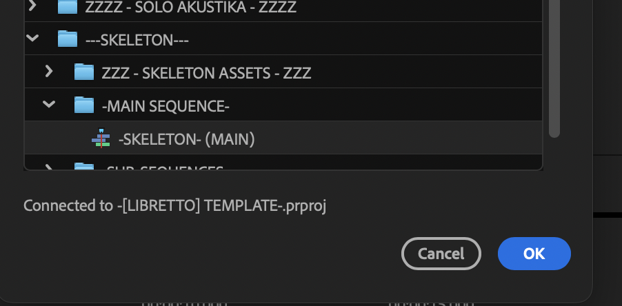
.
*THIS CREATES A NEW [TOP-LEVEL] BIN NAMED AFTER THE [TEMPLATE]* –>
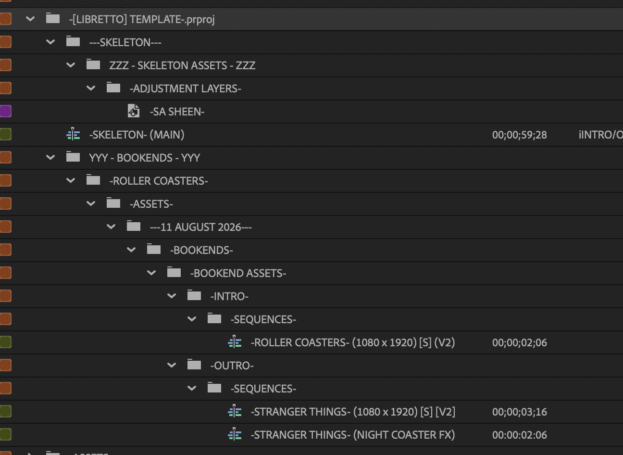
.
*ADD MULTIPLE [Z] TO BEGINNING OF [BIN NAME] TO MOVE IT TO THE [BOTTOM] OF YOUR [BIN DIRECTORY] IN [PROJECT PANEL]* —>
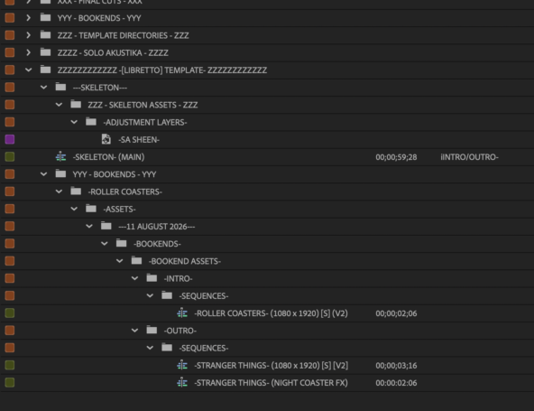
-DUPLICATE “SKELTON MAIN” SEQUENCE” + MOVE IT TO YOUR “TOP LEVEL”-
-CLOSE ALL [BINS]-
-SELECT THE “SKELETON SEQUENCE” + CREATE NEW “BIN” FROM “SELECTION”* —>
-[SHIFT] + [ b ]-
*ASSIGN A NAME WITH ENOUGH “Z” TO PLACE BIN AT BOTTOM OF [BIN DIRECTORY]* —>
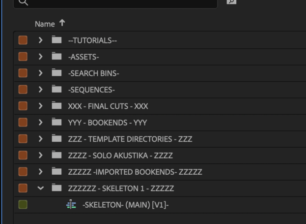
.
*”ESSENTIALS” WORKSPACE* —>
-[SHIFT] + [OPTION] + [ 3 ]-
.
-“RESET TO SAVED LAYOUT”
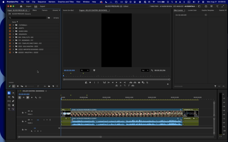
.
*OPEN YOUR “SKELETON SEQUENCE”* —>
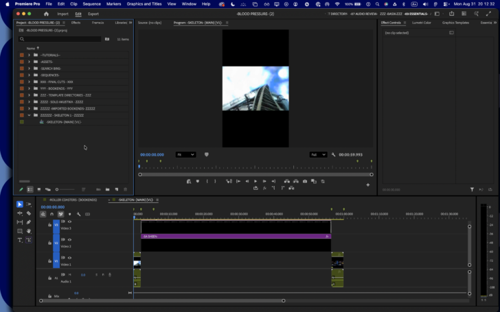
.
-IF YOU ARE ALREADY USING A “SOLO AKUSTIKA” CLIP IN ANOTHER SEQUENCE, NAVIGATE TO THAT SEQUENCE IN [TIMELINE], SELECT THE [CLIP]-
*COPY THE SELECTION* —>
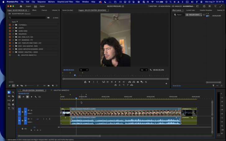
.
-NAVIGATE TO THE [SKELETON SEQUENCE] + TRACK TARGET [V1] + [A1]-
-MOVE [PLAYHEAD] TO END OF FIRST [BOOKEND]-
-PASTE THE [COPIED CLIPS] INTO THE [SEQUENCE]-
-CLEAR THE [SEQUENCE MARKER] NEAR THE [5-SECOND] MARK-
.
.
.
.
.
.
.
.
.
-CREATE A [[SONG] PROJECT] FROM [TEMPLATE]-
.
.
*THE PROCESS* —>
([LOCAL/CLOUD] STORAGE SYSTEM)
.
-REVIEW [SONG CHARTS] ON [iPHONE / iPAD]-
-[SOLO AKUSTIKA] TRIFECTA VIDEO CAPTURE-
.
.
.
-CREATE “DAILY DIRECTORIES” IN YOUR [“DAILY IMPORTS” [LOCAL] DIRECTORY]-
-CREATE “DAILY DIRECTORIES” IN YOUR [“RAW MATERIALS” [GOOGLE DRIVE] DIRECTORY]-
-TRANSFER [CLIP] FROM [iPHONE] TO [MACBOOK PRO]-
-TRANSFER [CLIP] FROM [MACBOOK PRO] TO [GOOGLE DRIVE]-
-CREATE A [CLIP PROFILE] WORDPRESS ENTRY-
.
.
.
*OPEN “BOOKEND SEQUENCE” IN [TIMELINE]* —>
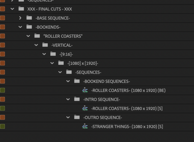
.
*OPEN “BASE LIBRETTO SEQUENCE” IN [SOURCE MONITOR]* —>
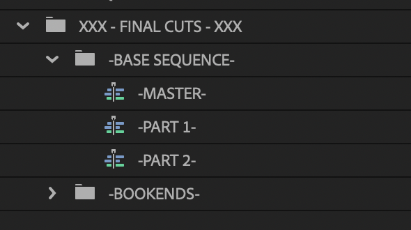
.
*NAVIGATE TO [TIMELINE] + MOVE PLAYHEAD TO “BOOKEND INTERSECTION”* —>
.
.
.
*[CLIP MASTER] VARIATIONS* —>
-[FX MASTER] SEQUENCE-
-[ASPECT RATIO] SEQUENCE-
-EXPORTED [VIDEO FILE]-
.
*TO CREATE “ASPECT RATIO” MASTER CLIP VARIATIONS* —>
-“FINAL CUT” DIRECTORY-
-DUPLICATE [MASTER SEQUENCE]-
-RENAME “MASTER SEQUENCE” TO INDICATE ITS TARGET “RESOLUTION”-
-ADD IT TO ITS [“MASTER SEQUENCE” BIN] ASSIGNED TO YOUR TARGET “RESOLUTION”-
-OPEN THE [SEQUENCE]-
-IN “SEQUENCE SETTINGS”. UPDATE THE SEQUENCE’S “RESOLUTION” TO YOUR TARGET “RESOLUTION”-
-CLICK “OK”-
-SELECT ALL [CLIPS] IN [TIMELINE]-
“FIT TO FRAME”
.
.
.
-iPHONE 14-
-CAMERA APP-
-VIDEO-
-RECORD-
-STOP-
-PHOTOS APP-
-AIRDROP-
-DOWNLOADS-
-RAW MATERIALS-
-PREMIERE PRO-
(LOCAL EDITS)
-[FX CONTROLS] WORKSPACE-
-RESET TO [SAVED LAYOUT]-
-PROJECT PANEL-
-ASSETS-
-VIDEO ASSETS-
-INTROS-
“INTRO NAME”
-TEMPLATE DIRECTORY-
-RAW CLIP-
*CLOUD STORAGE* —>
‘/Users/joga/Library/CloudStorage/GoogleDrive-josephjgatti@gmail.com/My Drive/-RAW MATERIALS-/-MACBOOK PRO-/-PREMIERE PRO-/-TEMPLATES-/-INTROS-/-KING OF THE CATS-/-RAW CLIP-/-KING OF THE CATS-.mp4’
*DOWNLOAD TO “LOCAL STORAGE”* —>
‘/Users/joga/Desktop/-LOCAL EDITS-/-PREMIERE PRO-/-TEMPLATES-/-INTROS-/-KING OF THE CATS-/-RAW CLIP-/-KING OF THE CATS-.mp4’
-IMPORT INTO “RAW CLIP” BIN-
-CREATE A “TRIMMED CLIPS” BIN-
-CREATE A “CROSSFADE TRIM” BIN-
-DUPLICATE “RAW CLIP” + INSERT INTO “BIN”-
-NOTE THE CLIP’S “FRAME RATE” + “VIDEO DURATION”-
-[29.97] FPS-
(ROUND TO [30])
-1 [SECOND] = 30 [FRAMES]-
-IF YOU SET YOUR “DEFAULT CROSSFADE DURATION” TO [1 SECOND] (30 FRAMES), YOU MUST HAVE [1/2 SECOND] / [15 FRAME] “CLIP HANDLES” AT [BEGINNING/END] OF [RAW CLIP]-
-OPEN DUPLICATED CLIP IN “SOURCE MONITOR”-
-ADD [IN/OUT] POINTS 15 FRAMES [IN/OUT]-
-USE THIS [TRIMMED CLIP] TO INSERT INTO [SEQUENCES]-
-NOTE [DISPLAY RESOLUTION] OF CLIP IN [PROJECT PANEL]-
-OPEN [RAW CLIP] IN [SOURCE MONITOR]-
-EXPORT MODE-
*SELECT THE “PRORES 422” [PRE-SET]* —>
.
*EXPORT SETTINGS* —>
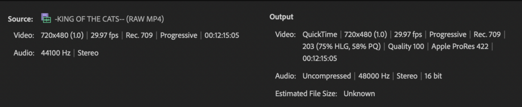
.
*EXPORT [ENTIRE SOURCE]* —>
.
*EXPORT TO THIS [FILE-PATH]* —>
‘/Users/joga/Library/CloudStorage/GoogleDrive-josephjgatti@gmail.com/My Drive/-RAW MATERIALS-/-MACBOOK PRO-/-PREMIERE PRO-/-TEMPLATES-‘
.
-[12 MINUTES] / [15 SECONDS]-
-[735 SECONDS]-
*RAW INPUT* —> [67.3 MB]-
-[0.09] MB / SECOND]-
-[90] KB / SECOND]-
-[5.4] MB / MINUTE]-
*RAW OUTPUT* —> -[1.83 GB]-
-.[1,830] MB-
-.[1,830] MB-
(OVER 27x LARGER THAN INPUTTED “RAW CLIP”)
.
*VIDEO OUT* —> -[1.69 GB]-
*AUDIO OUT* —> -[142.3 MB]-
.
.-KEEP A RECORD IN THE CLIP’S [WORDPRESS ENTRY]-
-[CLIP INDEX] TO YOUR [LOCAL EDITS]-
.
-OPEN THE “RAW CLIP” IN [SOURCE MONITOR]-
-ADD “TIMESTAMP MARKERS” TO THE CLIP-
-[DOUBLE-CLICK] THE MARKERS TO ADD “NAME / COMMENTS”-
-HOVER POINTER OVER MARKERS TO DISPLAY “NAME / COMMENTS”-
-NAVIGATE THE [SOURCE CLIP] VIA “MARKERS PANEL”-
-TO “ZOOM TO DURATION”, DOUBLE-CLICK THE BOTTOM “SCROLL BAR-
-SET [IN/OUT] POINTS-
-CREATE [SUB-CLIP]-
*MOVE [SUBCLIP] TO THIS BIN* —>
“ASSETS” —> “VIDEO ASSETS” —> “INTROS” —-> “INTRO NAME” —> “TRIMMED CLIPS” —> “TRIM 1”-
-CLEAR ALL [CLIPS] FROM [SOURCE MONITOR]-
-DUPLICATE THE “INPUT” RAW CLIP IN [PROJECT PANEL]-
-MARK THIS CLIP AS YOUR “EXPORT”-
-OPEN CLIP IN “SOURCE MONITOR”-
-SUBTRACT [15 FRAMES] FROM [IN POINT]-
-ADD [15 FRAMES] TO [OUT POINT]-
-MARK [TIMESTAMPS] IN THE INTRO CLIP’S [WP ENTRY]-
-CREATE ANOTHER [SUBCLIP] FROM THIS [IN/OUT] POINT-
-MOVE THE [SUBCLIP] TO YOUR “TRIM 1” BIN-
-CLEAR ALL [CLIPS] FROM [SOURCE MONITOR]-
-OPEN THE NEW [SUBCLIP] IN [SOURCE MONITOR]-
*EXPORT TO THIS [FILEPATH]* —>
‘/Users/joga/Library/CloudStorage/GoogleDrive-josephjgatti@gmail.com/My Drive/-RAW MATERIALS-/-MACBOOK PRO-/-PREMIERE PRO-/-TEMPLATES-/-INTROS-/-KING OF THE CATS-/-TRIMMED EXPORTS-/-NATIVE-/-[VIDEO-AUDIO]-‘
-EXPORT “VIDEO ONLY” VERSION-
-EXPORT “AUDIO ONLY” VERSION-
.
*CREATE [SEQUENCE] FROM YOUR [TRIMMED CLIP]* —>
“ASSETS” —> “VIDEO ASSETS” —> “INTROS” —> “INTRO NAME” —> “TRIMMED CLIPS” —> “TRIM 1”
“SEQUENCE CLIP”
*MOVE [SEQUENCE] TO THIS [BIN]* —>
“SEQUENCES” —> “INTRO SEQUENCES” —> “INTRO NAME” —> “NATIVE AR”
—DOUBLE-CLICK THE SEQUENCE TO OPEN IT IN [TIMELINE]-
-CLICK ANY EMPTY PART OF THE [TIMELINE] TO [DE-SELECT] CLIP-
-GO FULL SCREEN-
-OPTION-CLICK THE [AUDIO TRACK] TO SELECT IT-
-PRESS ]DELETE] TO DELETE THE SELECTED [AUDIO TRACK]-
.-MOVE [PLAYHEAD] TO BEGINNING OF [TIMELINE]-
-ZOOM TO SEQUENCE-
-EXIT [FULL SCREEN]-
-IMPORT AN [AUDIO FILE] INTO [PROJECT PANEL]-
“ASSETS” —> “AUDIO ASSETS” —> “SOUNDCLOUDS” —> “SOUNDCLOUD NAME” —> “RAW CLIP”
-CREATE A [DUPLICATE] AUDIO-
-NAME THEM “RAW IN” + “IN/OUT”-
OPEN “IN/OUT” IN [SOURCE MONITOR]-
-MOVE [PLAYHEAD] TO BEGINNING OF [SOURCE MONITOR] + [TIMELINE]-
-OVERWRITE THE AUDIO INTO THE [TIMELINE]-
-SO THAT IT IS PLACED DIRECTLY UNDER YOUR “VIDEO CLIP”-
-CLOSE THE “AUDIO TRACK” IN [SOURCE MONITOR]-
-CLOSE THE “SOURCE MONITOR”–
-UNLOCK THE “VIDEO TRAX”-
“SELECT ALL”
-LINK “VIDEO/AUDIO”-
*EXPORT TO THIS “CLOUD FILEPATH”* —>
‘/Users/joga/Library/CloudStorage/GoogleDrive-josephjgatti@gmail.com/My Drive/-RAW MATERIALS-/-MACBOOK PRO-/-PREMIERE PRO-/-TEMPLATES-/-INTROS-/-ROLLER COASTERS-/-TRIMMED EXPORTS-/-NATIVE-/-[VIDEO-AUDIO]-/-ROLLER COASTERS- (2020).mov’
.
-CREATE A [SEQUENCE PRE-SET] FOR THIS [DISPLAY RESOLUTION]-
“SEQUENCES” —> “BASE SEQUENCES”
-FOR UNORTHODOX “ASPECT RATIOS”, CREATE [SEQUENCE] FROM [CLIP]-
*MOVE [SEQUENCE] TO THIS [BIN FILE-PATH]* —>
“SEQUENCES” —> “INTRO SEQUENCES”
.
.
.
.
*OPEN [PROJECT]* —>
-[COMMAND] + [ o ]-
*OPEN THE [LIBRETTO] TEMPLATE* —>
“PROJECT TEMPLATES”
‘/Users/joga/Documents/Adobe/Common/Assets/Project Templates/-[LIBRETTO] TEMPLATE-.prproj’
*FINDER TAG* —>
“PP TEMPLATE PROJECTS”
.
-CREATE A “PROJECT PROFILE” WORDPRESS DATABASE-
.
*USE [12-BIN] OUTLINE TO BUILD YOUR “TEMPLATE PROJECTS”* —>
.
*CREATE “9-BIN” FINDER DIRECTORIES* —>
.
*[EFFECT CONTROLS] WORKSPACE* —>
-[SHIFT] + [OPTION] + [ 4 ]-
*RESET TO “SAVED LAYOUT”* —>
-[SHIFT] + [OPTION] + [ 0 ]-
-PROJECT PANEL-
-FILL SCREEN-
“SEQUENCES” —> “BASE SEQUENCES” —> -[1080] x [1920]-
-OPEN [SEQUENCE] IN [TIMELINE]-
-RETURN TO “PROJECT PANEL”-
“ASSETS” —> “VIDEO ASSETS” —> “INTROS”
-DOWNLOAD “RAW CLIP” FROM [“CLOUD” —> “DEVICE”]-
*CLOUD FILEPATH* —>
“RAW MATERIALS”
‘/Users/joga/Library/CloudStorage/GoogleDrive-josephjgatti@gmail.com/My Drive/-RAW MATERIALS-/-MACBOOK PRO-/-PREMIERE PRO-/-TEMPLATES-/-INTROS-‘
*LOCAL FILEPATH* —>
“LOCAL EDITS”
‘/Users/joga/Desktop/-LOCAL EDITS-/-PREMIERE PRO-/-TEMPLATES-/-INTROS-‘
.
-[PREMIERE PRO] PROJECT-
-[BIN] FILE-PATH-
-SEQUENCE-
.
-PROJECT PANEL-
“LIST VIEW”
“FILL SCREEN”
-CLICK THE TOP “RIGHT ARROW” TO DISPLAY ALL [BINS / ITEMS] IN THE [PROJECT DIRECTORY]-
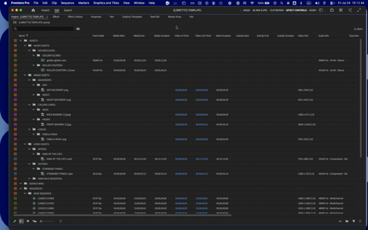
“ASSETS” —> “VIDEO ASSETS” —> “INTROS”
-CREATE A “TEMPLATE DIRECTORY” BIN-
-ASSIGN A BIN TO ITS “INTRO BIN”-
-COPY/PASTE THE “TEMPLATE DIRECTORY” INTO THAT [BIN]-
-OPEN THE “RAW CLIP” BIN-
-IMPORT THE “RAW CLIP”-
*NAME THE “RAW CLIP”* —>
“KING OF THE CATS” (RAW MP4)
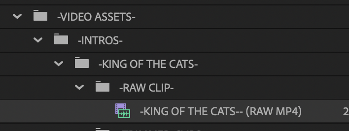
*OPEN [SELECTED CLIP] IN [SOURCE MONITOR]* —>
-[SHIFT] + [ o ]-
-FILL SCREEN-
-MOVE [PLAYHEAD] TO [BEGINNING] OF [TIMELINE]-
-ADD [MARKER]-
-MOVE [PLAYHEAD] TO [END] OF [TIMELINE]-
-ADD [MARKER]-
-MOVE [PLAYHEAD] TO [BEGINNING] OF [TIMELINE]-
-CLOSE ALL [CLIPS/SEQUEBCES] IN [SOURCE MONITOR]* —>
-[SHIFT] + [ c ]-
*RESET TO “SAVED LAYOUT”-
*NAVIGATE TO [PROJECT PANEL]* —>
-[ ! ] –
*NAVIGATE BACK TO “RAW CLIP” BIN* —>
“ASSETS” —> “VIDEO ASSETS” —> “INTROS”
.
-DUPLICATE THE “RAW CLIP”-
-MOVE THE “DUPLICATED CLIP” TO THE “CROSSFADE TRIM” BIN-
*RE-NAME THE “DUPLICATED CLIP”* —>
“KING OF THE CATS” (CROSSFADE TRIM)
-CLICK THE “CROSSFADE TRIM” CLIP TO SELECT IT-
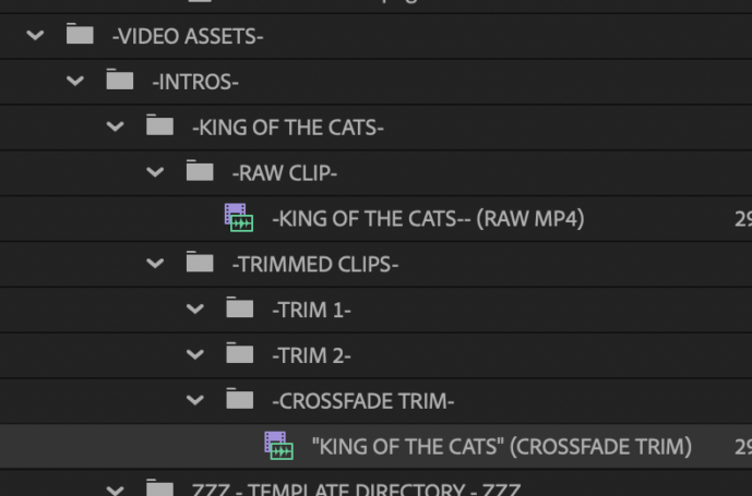
*OPEN [SELECTED CLIP] IN [SOURCE MONITOR]* —>
-[SHIFT] + [ o ]-
-FILL SCREEN-
-MOVE [PLAYHEAD] TO [BEGINNING] OF [TIMELINE]-
-ZOOM ALL THE WAY IN-
*PLAYBACK PREFERENCES* —>
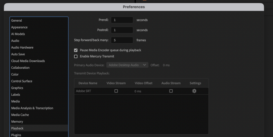
*MOVE [PLAYHEAD] [BACK/FORWARD] 5 FRAMES* —>
-[SHIFT] + [LEFT/RIGHT ARROW]-
“TIMELINE PREFERENCES* —>
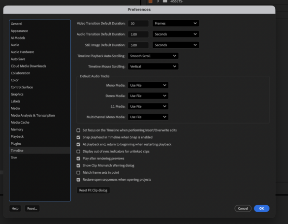
*VIDEO TRANSITION DEFAULT DURATION* —>
-[30] FRAMES-
(OR [1-SECOND] FOR [30 FPS] FRAME RATES)
-APPLIES TO [FADE IN/OUT] + [CROSS FADES]-
-RETURN TO [PROJECT PANEL]-
-HOVER [POINTER] OVER THE [CROSSFADE TRIM] CLIP TO VIEW ITS [FRAME RATE]* —>
-[29.97] FPS-
(~ 30 FPS)
-RETURN TO [SOURCE MONITOR]-
-MOVE [PLAYHEAD] TO [BEGINNING] OF [TIMELINE]-
*FOR [30 FPS] FRAME RATE* —>
*MOVE [PLAYHEAD] FORWARD [15 FRAMES]-
-HIT [SHIFT] + [RIGHT ARROW]-
(x 3)
-ADD [MARKER]-
-ADD [IN POINT]-
-MOVE [PLAYHEAD] TO [END] OF [TIMELINE]-
*MOVE [PLAYHEAD] BACKWARD [15 FRAMES]-
-HIT [SHIFT] + [LEFT ARROW]-
(x 3)
-ADD [MARKER]-
-ADD [IN POINT]-
-MOVE [PLAYHEAD] TO [BEGINNING] OF [TIMELINE]-
-RETURN TO [PROJECT PANEL]-
.
-NAVIGATE TO [TIMELINE PANEL]
-THE [TIMELINE PANEL] HOSTS OPEN “SEQUENCES”-
-DISPLAYED AS “TABS” WHEN MULTIPLE “SEQUENCES” ARE OPENED-
.
*WHEN NO “SEQUENCE” IS OPENED* —>
.
*TO CREATE A [SEQUENCE] FROM THE “TIMELINE PANEL”* —>
-[COMMAND] + [ n ]-
.
.
*CREATE A [SEQUENCE] FROM YOUR [1080 x 1920] SEQUENCE [PRE-SET]* —>
.
*TO REVEAL OPENED [SEQUENCE] IN “PROJECT PANEL”* —>
-[COMMAND] + [CONTROL] + [ r ]-
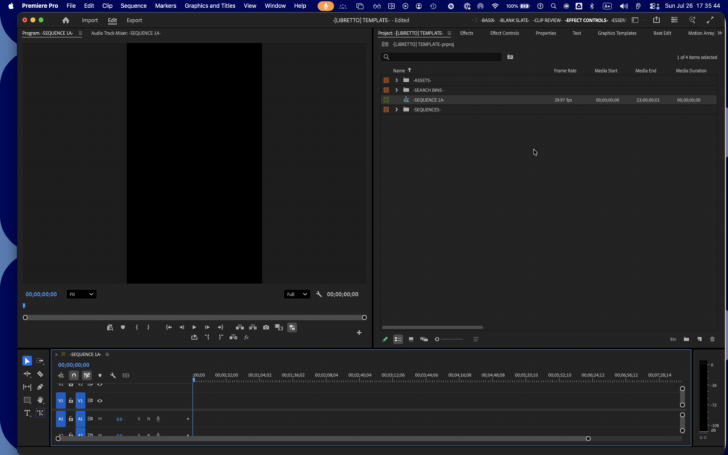
.
-RETURN TO [TIMELINE PANEL]-
.
*TO CLOSE [OPENED SEQUENCE] IN [TIMELINE PANEL]* —>
-[COMMAND] + [ w ]-
.
-NAVIGATE BACK TO [PROJECT PANEL]-
*FILL SCREEN-
-EXPAND ALL BINS-
.
*SET PROJECT PANEL TO “CUSTOM VIEW” [PRE-SET]* —>
-[SHIFT] + [COMMAND] + [ p ]-
.
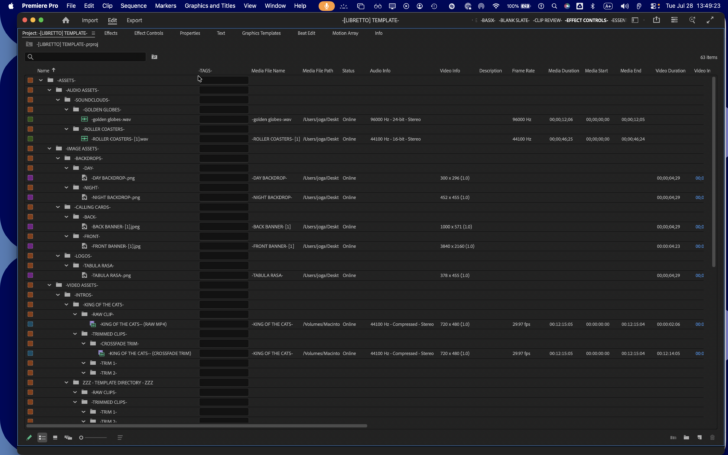
.
-CLICK THE “LEFTMOST METADATA COLUMN” TO SORT ITEMS BY “LABEL”-
(AKA “TYPE”)
.
-ADD [SEQUENCE PROFILE] TO THIS [WORDPRESS ENTRY]* —>
.
*TO [RE-OPEN] A SEQUENCE* —>
-NAVIGATE TO [PROJECT PANEL]-
.
-[PROJECT PANEL] VIEW [PRE-SETS]-
.
*DELETE [EMPTY TRACKS]* —>
-[COMMAND] + [CONTROL] + [DELETE]-
-WHEN YOU USE THIS FUNCTION, YOU ARE LEFT WITH 1 [VIDEO TRACK] + 1 [AUDIO TRACK]-
.
.
*TO DELETE TRACKS* —>
-[COMMAND] + [DELETE]-
.
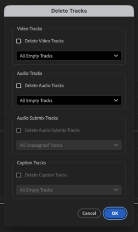
.
*TO ADD [CLIP] TO [SEQUENCE]* —>
-NAVIGATE TO [PROJECT PANEL]-
“SEARCH BINS” —> “ASSET TYPES” —> “VIDEO/AUDIO”
-CLICK [CLIP] TO SELECT IT-
-OPEN [CLIP] IN [SOURCE MONITOR]-
-INSERT [CLIP] INTO [TIMELINE]-
*[CLIP REVIEW] WORKSPACE* —>
-[SHIFT] + [OPTION] + [ 3 ]-
*ZOOM TO FILL TIMELINE* —>
-[ \ ]-
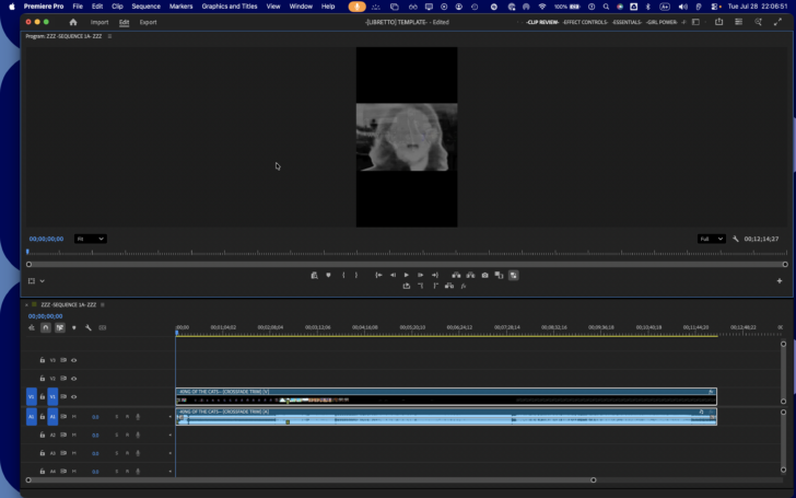
.
*HOVER POINTER OVER CLIP TO VIEW “CLIP INFO”* —>
.
-CLICK CLIP TO SELECT IT-
-PRESS [ESCAPE] TO [DE-SELECT] IT-
.
*TOGGLE “LINKED SELECTION”* —>
-[OPTION] + [ l ]-
.
*WHEN VIDEO/AUDIO TRACK IS LINKED, CLICKING 1 SELECTS THEM BOTH* —>

.
*TO LINK/UNLINK SELECTION* —>
-[COMMAND] + [ l ]-
.
*TO DELETE SELECTED TRAX* —>
-[DELETE]-
.
*TO [UN-DO]* —>
-[COMMAND] + [ z ]-
.
*TO [RE-DO]* —>
-[SHIFT] + [COMMAND] + [ z ]-
.
-IF YOU HAVE TRIMMED THE BEGINNING OF A CLIP IN A [TIMELINE SEQUENCE]. MOVE PLAYHEAD TO BEGINNING OF CLIP IN [TIMELINE] + PRESS [ f ] TO OPEN THE ORIGINAL RAW CLIP IN [SOURCE MONITOR]-
-YOUR [SOURCE MONITOR] PLAYHEAD WILL BE POSITIONED AT THE FRAME WHERE YOU MADE THE ORIGINAL TRIM-
*NOTE THE TIMESTAMP + LOG IT IN YOUR “CLIP WP ENTRY”* —>
-[2 MINUTES / 31 SECONDS / 21 FRAMES]-
-FOR [30 FPS], [21 FRAMES] IS [0.7 SECOND]-
.
*MOVIE* —>
([VIDEO/AUDIO] LINKED CLIP)
-IRIS-

*VIDEO CLIP* —>
-VIOLET-

.
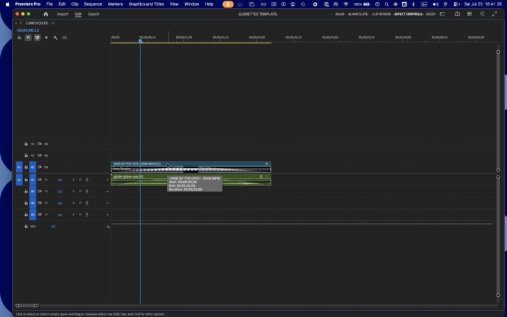
.
*LOCK ALL [AUDIO/VIDEO] TRAX* —>
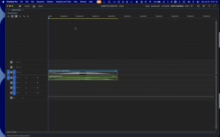
.
.
.
.
.
.
.
.
.
.
.
.
*COPY/PASTE THE “LIBRETTO TEMPLATE” TO THIS [CLOUD FILEPATH]* —>
“RAW MATERIALS”
“MACBOOK PRO”
“PREMIERE PRO”
“TEMPLATES”
‘/Users/joga/Library/CloudStorage/GoogleDrive-josephjgatti@gmail.com/My Drive/-RAW MATERIALS-/-MACBOOK PRO-/-PREMIERE PRO-/-TEMPLATES-‘
.
.
-iPHONE 14-
-CAMERA APP-
-VIDEO-
-[PHOTOS] iOS APP-
-[LIBRARY] TAB-
“SELECT”
“SHARE”
-“MACBOOK 2” AIRDROP-
*DOWNLOADS* —>
/Users/joga/Downloads
-HIDE ALL “FILE EXTENSIONS”-
*SORT BY KIND* —>
-[COMMAND] + [OPTION] + [CONTROL] + [ k ]-
*USE GROUPS* —>
-[COMMAND] + [CONTROL] + [ 0 ]
*MOVE [IMAGES] TO THIS FOLDER* —>
“RAW MATERIALS”
~/Library/Mobile Documents/com~apple~CloudDocs/-RAW MATERIIALS-/-PIX-/ZZZ – SCATTERSHOTS – ZZZ
*MOVE “VIDEOS” TO THIS “SYNC FOLDER”* —>
“SYNC”
‘/Users/joga/Library/CloudStorage/GoogleDrive-josephjgatti@gmail.com/My Drive/-SYNC-/-CLIPS-‘
*REVIEW “CLIPS” VIA [iPHONE / iPAD]-
-CONNECT [AIRPODS] TO [DEVICE]-
-DOCUMENTS APP-
“MY FILES”
“SYNCED FOLDERS”
“CLIPS”
*FOR “SOLO AKUSTIKA” CLIPS* —>
-TAKE HANDWRITTEN NOTES-
(“DURATION” / “TITLES” / “TIMESTAMPS” / “COMMENTS”)
*PHOTOGRAPH THE NOTES + UPLOAD THEM TO THIS [WORDPRESS ENTRY]* —>
*RENAME THE FILES IN THIS FORMAT* —>
“SONG TITLE” (5m 30s) [2026-1-30] (FRONT / REAR / DOUBLETAKE) [MOBILE / STATIC]
*MOVE ALL OTHER [CLIPS] TO THIS [DIRECTORY]* —>
“REVIEWED CLIPS”
“SCATTTERSHOTS”
‘/Users/joga/Library/CloudStorage/GoogleDrive-josephjgatti@gmail.com/My Drive/-REVIEWED CLIPS-/-SCATTERSHOTS-‘
*CREATE “CLIP CATEGORIES”* —>
(INTRO / OUTRO / LINX / ETC)
*BACK UP THE “SOLO AKUSTIKA” RAW CLIP TO ITS “SONG FOLDER” ON [GOOGLE DRIVE]* —>
“THE LONG RUN”
‘/Users/joga/Library/CloudStorage/GoogleDrive-josephjgatti@gmail.com/My Drive/-FINAL CUTS-/-TRAX-/-SOUNDCLOUDS-/-THE LONG RUN-/-STOP MOTION-/-SOLO AKUSTIKA-/-RAW MATERIALS-/-[2026 29 6]- -STOP MOTION [2|27]- (FRONT).mov’
*INDEX THE “RAW CLIP” TO THIS “LOCAL FOLDER”* —>
“LOCAL EDITS”
“PREMIERE PRO”
“PROJECTS”
“MUSIC VIDEOS”
‘/Users/joga/Desktop/-LOCAL EDITS-/-PREMIERE PRO-/-PROJECTS-/–MUSIC VIDEOS–/-STOP MOTION-/-CLIPS-/-SOLO AKUSTIKA-/-RAW MATERIALS-/-[2026 29 6]- -STOP MOTION [2|27]- (FRONT).mov’
-OPEN [PREMIERE PRO]-
“CREATE NEW [PROJECT]”
*USE THE [LIBRETTO] TEMPLATE* —>
‘/Users/joga/Documents/Adobe/Common/Assets/Project Templates/-[LIBRETTO] TEMPLATE-.prproj’
*COPY/PASTE THE “LIBRETTO TEMPLATE” TO THIS [CLOUD FILEPATH]* —>
“RAW MATERIALS”
“MACBOOK PRO”
“PREMIERE PRO”
“TEMPLATES”
‘/Users/joga/Library/CloudStorage/GoogleDrive-josephjgatti@gmail.com/My Drive/-RAW MATERIALS-/-MACBOOK PRO-/-PREMIERE PRO-/-TEMPLATES-‘
*SAVE [PROJECT] TO THIS LOCAL [FILE PATH]* —>
“LOCAL EDITS”
“PREMIERE PRO”
“PROJECTS”
“MUSIC VIDEOS”
‘/Users/joga/Desktop/-LOCAL EDITS-/-PREMIERE PRO-/-PROJECTS-/–MUSIC VIDEOS–/-STOP MOTION-/–PROJECT FILES–/-STOP MOTION- [1].prproj’
*AFTER EVERY [EDITING SESSION], [COPY/PASTE] THE [PROJECT FILE] TO THIS [CLOUD FILEPATH]* —>
“THE LONG RUN”
“SOURCE CODE”
“PREMIERE PRO”
‘/Users/joga/Library/CloudStorage/GoogleDrive-josephjgatti@gmail.com/My Drive/-FINAL CUTS-/-TRAX-/-SOUNDCLOUDS-/-THE LONG RUN-/-STOP MOTION-/-SOURCE CODE-/-PREMIERE PRO-‘
*NAVIGATE TO THE “CLOUD FILEPATH” CONTAINING THE “RAW CLIP”* —>
“THE LONG RUN”
‘/Users/joga/Library/CloudStorage/GoogleDrive-josephjgatti@gmail.com/My Drive/-FINAL CUTS-/-TRAX-/-SOUNDCLOUDS-/-THE LONG RUN-/-STOP MOTION-/-SOLO AKUSTIKA-/-RAW MATERIALS-/-[2026 29 6]- -STOP MOTION [2|27]- (FRONT).mov’
*COPY/PASTE “RAW CLIP” TO THIS [LOCAL FILEPATH]* —>
“LOCAL EDITS”
“PREMIERE PRO”
“PROJECTS”
“MUSIC VIDEOS”
‘/Users/joga/Desktop/-LOCAL EDITS-/-PREMIERE PRO-/-PROJECTS-/–MUSIC VIDEOS–/-STOP MOTION-/-CLIPS-/-SOLO AKUSTIKA-/-RAW MATERIALS-/-[2026 29 6]- -STOP MOTION [2|27]- (FRONT).mov’
-INTRO-
*SAVE [INTROS] TO THIS [CLOUD FILEPATH]* —>
“TEMPLATES”
‘/Users/joga/Library/CloudStorage/GoogleDrive-josephjgatti@gmail.com/My Drive/-RAW MATERIALS-/-MACBOOK PRO-/-PREMIERE PRO-/-TEMPLATES-/-INTROS-‘
*INDEX TO THIS [LOCAL FILEPATH]* —>
“TEMPLATES”
‘/Users/joga/Desktop/-LOCAL EDITS-/-PREMIERE PRO-/-TEMPLATES-/-INTROS-‘
-OUTRO-
*SAVE [OUTROS] TO THIS [CLOUD FILEPATH]* —>
“TEMPLATES”
‘/Users/joga/Library/CloudStorage/GoogleDrive-josephjgatti@gmail.com/My Drive/-RAW MATERIALS-/-MACBOOK PRO-/-PREMIERE PRO-/-TEMPLATES-/-OUTROS-‘
*INDEX TO THIS [LOCAL FILEPATH]* —>
“TEMPLATES”
‘/Users/joga/Desktop/-LOCAL EDITS-/-PREMIERE PRO-/-TEMPLATES-/-OUTROS-‘
-BACKDROPS-
*SAVE [BACKDROPS] TO THIS [CLOUD FILEPATH]* —>
“TEMPLATES”
‘/Users/joga/Library/CloudStorage/GoogleDrive-josephjgatti@gmail.com/My Drive/-RAW MATERIALS-/-MACBOOK PRO-/-PREMIERE PRO-/-TEMPLATES-/-BACKDROPS-‘
*INDEX TO THIS [LOCAL FILEPATH]* —>
“TEMPLATES”
‘/Users/joga/Desktop/-LOCAL EDITS-/-PREMIERE PRO-/-TEMPLATES-/-BACKDROPS-‘
-CALLING CARDS-
*SAVE OUTROS TO THIS [CLOUD FILEPATH]* —>
“TEMPLATES”
‘/Users/joga/Library/CloudStorage/GoogleDrive-josephjgatti@gmail.com/My Drive/-RAW MATERIALS-/-MACBOOK PRO-/-PREMIERE PRO-/-TEMPLATES-/-CALLING CARDS-‘
*INDEX TO THIS [LOCAL FILEPATH]* —>
“TEMPLATES”
‘/Users/joga/Desktop/-LOCAL EDITS-/-PREMIERE PRO-/-TEMPLATES-/-CALLING CARDS-‘
-HEADSHOTS-
*SAVE [HEADSHOTS] TO THIS [CLOUD FILEPATH]* —>
“TEMPLATES”
‘/Users/joga/Library/CloudStorage/GoogleDrive-josephjgatti@gmail.com/My Drive/-RAW MATERIALS-/-MACBOOK PRO-/-PREMIERE PRO-/-TEMPLATES-/-HEADSHOTS-‘
*INDEX TO THIS [LOCAL FILEPATH]* —>
“TEMPLATES”
‘/Users/joga/Desktop/-LOCAL EDITS-/-PREMIERE PRO-/-TEMPLATES-/-HEADSHOTS-‘
-LOGOS-
*SAVE [LOGOS] TO THIS [CLOUD FILEPATH]* —>
“TEMPLATES”
‘/Users/joga/Library/CloudStorage/GoogleDrive-josephjgatti@gmail.com/My Drive/-RAW MATERIALS-/-MACBOOK PRO-/-PREMIERE PRO-/-TEMPLATES-/-LOGOS-‘
*INDEX TO THIS [LOCAL FILEPATH]* —>
“TEMPLATES”
‘/Users/joga/Desktop/-LOCAL EDITS-/-PREMIERE PRO-/-TEMPLATES-/-LOGOS-‘
-PROJECT PANEL-
*2 BINS* —>
-ASSETS-
-SEQUENCES-
.
“ASSETS” BIN* —>
-IMAGE-
-AUDIO-
-VIDEO-
.
*”VIDEO ASSETS” BIN* —>
-INTROS-
-RAW SOLO AKUSTIKA-
-OUTROS-
.
*”INTROS” BIN* —>
“KING OF THE CATS”
.
“PROJECT PANEL”
“FILL SCREEN”
“LIST VIEW”
-[OPTION-CLICK] THE [TOP “RIGHT ARROW”] TO REVEAL ALL [BIN ITEMS]-
-MANUALLY DRAG THE [COLUMN BOUNDARY] SO THAT ALL “NAMES” ARE FULLY DISPLAYED-
-CLICK YOUR [TARGET BIN] TO SELECT IT-
-IMPORT [MP4]-
-CREATE [SEQUENCE] FROM [CLIP]-
-[DRAG/DROP] SEQUENCE INTO THE “INTRO SEQUENCE” BIN-
-APPEND “BASE SEQUENCE” TO THE “SEQUENCE NAME”-
-DUPLICATE THE SEQUENCE-
-APPEND THE DUPLICATED SEQUENCES WITH “PART #”-
-SELECT THE [[1920 x 1080] [PRE-SET]]-
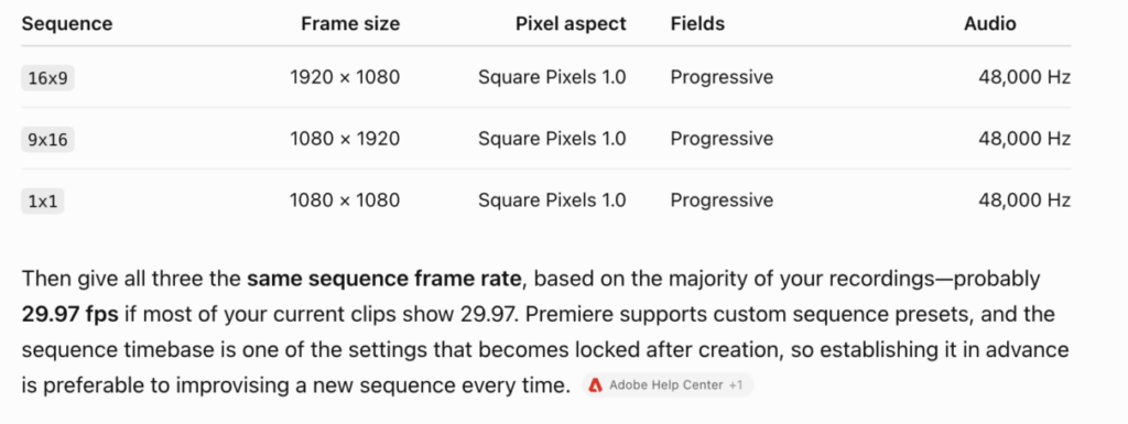
.
-FOR “INSTAGRAM STORIES”, OPEN YOUR “RAW” [9:16] SEQUENCE TEMPLATE-
-PROJECT PANEL-
“SEQUENCES” —> “TRIMMED SEQUENCES”
-CLICK THE “RAW SEQUENCE” TO SELECT IT-
(OR USE “ARROW KEYS”)
-[DOUBLE-CLICK] THE “RAW SEQUENCE” TO OPEN IT IN [TIMELINE]-
(OR PRESS [OPTION] + [ t ] )
-SELECT YOUR [[9:16] INTRO SEQUENCE] IN [PROJECT PANEL]-
“SEQUENCES” —> “INTRO SEQUENCES” —> “INTRO NAME” —> -[9:16]-
*TO OPEN IN “SOURCE MONITOR”* —>
-[SHIFT] + [ o ]-
*IN [TIMELINE]. TURN OFF “NESTS” WITH THIS BUTTON* —>
*DESELECT ALL “TRAX” IN THE LEFTMOST COLUMN* —>

-OUR INTRO SEQUENCE CONTAINS 1 [VIDEO TRACK] + 1 [AUDIO TRACK]-
-NAVIGATE TO [SOURCE MONITOR] + INSERT THE “INTRO SEQUENCE” INTO [TIMELINE]-
[ , ]
-IF NO “SOURCE PATCHES” ARE SELECTED, THE [SEQUENCE] IS NOT INSERTED-
*WHEN “V1” IS SELECTED, THE SEQUENCE’S “VIDEO TRACK” IS INSERTED* —>
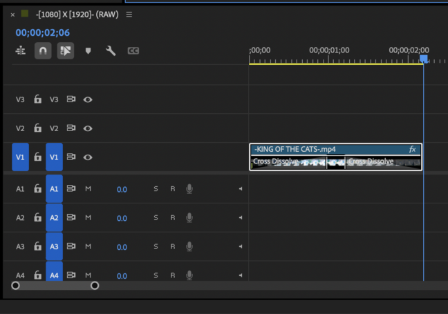
.
-IF ONLY “V2” IS SELECTED, THE [SEQUENCE] WILL NOT BE INSERTED-
(THE EXACT “TRACK NUMBERS” MUST MATCH BETWEEN “CHILD SEQUENCE” + “PARENT SEQUENCE”)
.
-IF “A1” IS SELECTED, ONLY THE “AUDIO TRACK” IS INSERTED-
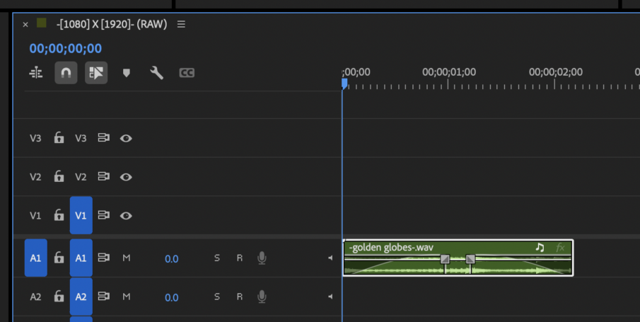
.
*SELECT BOTH “V1” + “A1” FOR A PROPER “NESTED SEQUENCE INSERT” CONSISTING OF “INDIVDUAL CLIPS”* —>
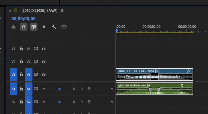
.
*INSERT “NESTED SEQUENCES” AS “NESTS”* —>

.
-WHEN THIS SETTING IS “ON”, YOU CAN ONLY SELECT A SINGLE “VIDEO TRACK” TO INSERT THE “NEST” INTO-
(THE NEST WILL CONTAIN BOTH YOUR “VIDEO TRACK” + “AUDIO TRACK”)
(THE AUDIO PLAYS BACK EVEN THOUGH ALL “AUDIO TRACKS” IN [TIMELINE] ARE EMPTY)
(IF YOU DON’T SELECT ANY TRACKS, THE “SEQUENCE” WILL NOT BE INSERTED)
.
-[29.97] FRAME RATE-
-[INTRO] + [OUTRO] = [5 SECONDS] / [19 FRAMES]-
-[19 FRAMES] = [0.634 SECOND]-
-[5.634] SECONDS-
-SO THE “INSTAGRAM STORY” BODY MUST BE SHORTER THAN [54.66] SECONDS-
.
.
-TOP-
.
XXX
.
.
-SECTION 1-
-SECTION 2-
-SECTION 3-
.
.
-section1start-
-SECTION 1-
X
.
-section2start-
-SECTION 2-
X
.
-section3start-
-SECTION 3-
X
.
-groundzero-
.
X
-SECTION 3-
-section3end-
.
X
-SECTION 2-
-section2end-
.
X
-SECTION 1-
-section1end-
.
.
XXX
.
-BOTTOM-
.
-SF1 TOP-
(TEMPLATE)
-SF1 BOTTOM-
(TEMPLATE)
.
.
-DAILY NOTES-
XXX
-“STOP MOTION” PROJECT-
.
*”DAILY SEQUENCE IMPORT” BIN* —>
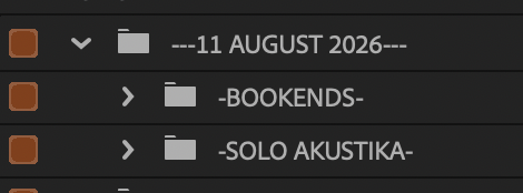
.
-BOOKENDS BIN-
-BOOKENDS SEQUENCE-
SANDBOX DUPLICATE
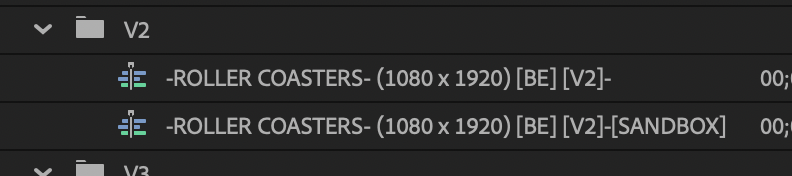
V2
1:37
INTRO SEQUENCE
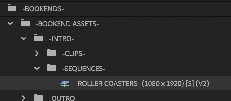
.
-INTRO CLIP-

-SEQUENCE CLIP-
.
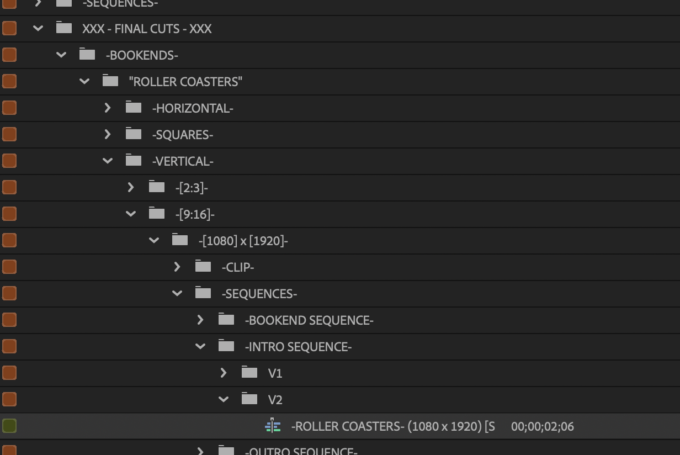
.
RAW MATERIAL MAKE IT LOOK BETTER
The current source has that indoor yellow/beige wash.
I would not try to make it look cinematic or psychedelic yet.
Just see whether you prefer:
slightly less yellow/orange
a little more separation between you and the background
slightly richer blacks
modest saturation/contrast
skin still looking believable
ADJUSTMENT LAYER
Put that treatment on its own adjustment layer rather than embedding a pile of changes directly into every clip.
That establishes an extremely useful distinction:
correction = always there
creative coloration = something that happens
Then later, when the image suddenly becomes blue, magenta, monochrome, oversaturated, inverted, etc., the change actually means something.
2. ATMOSPHERE — “something is happening behind/in/through reality”
This is where the deep-space experiment belongs.
Rather than asking “what cool overlay should I use?”, I think you can reduce the choices dramatically by building a small STOP MOTION vocabulary of visual verbs:
ATTRACT
REPEL
ORBIT
VIBRATE
STRETCH
KNOT / BIND
BREAK / RELEASE
CONVERGE
ANNIHILATE
Then every new effect you learn has to become one of those verbs.
That’s much more useful than collecting “glitch effect,” “blur effect,” “warp effect,” “color effect,” etc.
For example:
opacity + deep-space layer + scale keyframes = CONVERGE
position keyframes moving two objects apart = REPEL
rotation + position = ORBIT
rapid small position/scale changes = VIBRATE
Now Premiere effects become a visual language for the STOP MOTION mythology instead of a bag of presets.
.
And you only need to learn one verb/effect combination per cycle.
Your first actual lyric experiment is almost sitting there asking for it
You have:
“and even as my soul exploded…”
That is a perfect first controlled sandbox moment.
Don’t animate the whole minute.
Leave everything relatively normal and make that one phrase the event.
For example:
deep-space layer begins almost imperceptibly
opacity rises as you approach “soul”
space enlarges / pushes toward camera
on “exploded,” image/color reaches maximum disturbance
lyric itself separates, gets shoved, scattered, enlarged, or pulled toward opposite sides
effect quickly resolves back toward the normal performance
That teaches you several things at once without requiring five different effects:
keyframe timing → opacity → scale/movement → interaction with lyric
And importantly, it gives you an A/B test:
was “soul exploded” actually more satisfying after the treatment?
If yes, that mechanism gets promoted into the toolbox.
If not, kill it.
That’s exactly the equivalent of trying reverb on the next audio cycle.
3. LYRIC ACTION — captions stop being subtitles and become objects
This is where I think the idea gets unusually strong.
Most of the lyrics can remain ordinary readable captions.
Then occasionally a lyric becomes a physical participant in the Light Web.
Instead of endlessly inventing typography, let the meaning determine the force acting on the text.
So a future vocabulary might become:
attraction → two words slowly pulled together
repulsion → phrase splits apart
gravity → line sags/falls toward an object
charge → words snap toward opposite poles
string tension → phrase stretches across the screen
information death → letters lose organization / disappear
annihilation → two graphic objects meet and both vanish
motion → text refuses to stay anchored
That immediately makes your idea of a “visual tug of war” between captions and animation coherent.
The animation isn’t decorating the lyric.
The lyric is being subjected to the physics of the universe you’re depicting.
That gives you potentially years of variations without needing a new aesthetic every week.
And restraint will make it stronger: perhaps one or two “hero lyric” events per minute, while everything else remains legible and stable.
4. BADGE — make this almost completely non-negotiable
I would install the badge fairly early in the process because it’s not really an “effect.” It’s infrastructure.
Have one reusable layer/component that always sits in the same relative corner and scale.
Default: mushroom-cloud JOGA mark.
Then allow occasional context badges:
- ladder mushroom
- special STOP MOTION symbol
- eventual charge/string icon
But I’d make the mushroom cloud the control/default. The ladder version becomes meaningful precisely because it isn’t on every clip.
And your ladder itself could become much bigger than a logo.
The actual physical ladder is almost an ideal rapid-fire STOP MOTION machine because the camera can remain absolutely fixed while you change only one physical variable:
magnet appears
magnet disappears
wire wraps rung
chess piece enters
rubber-band ball rises
pairing occurs
whole arrangement collapses
Those can become tiny 5–20-frame inserts and transition LINX rather than requiring elaborate animated sequences.
That makes the mess of physical experimentation feed directly into reusable Premiere assets.
5. BOOKENDS / LINX — one new pair per week is an excellent limit
I would formalize your rule exactly that way:
ONE NEW BOOKEND PAIR PER WEEK.
Not “make more animations.”
A pair.
The opening establishes a physical problem.
The closing resolves/transforms it.
That prevents you from accumulating a folder of unrelated cool images.
For example:
PRIMORDIAL REPULSION
opening: unity cannot remain still → separation erupts
closing: separated pairs finally synchronize → whole structure collapses through the center
INFORMATION DEATH
opening: ordered ladder degrades into rubber-band chaos
closing: chaos remembers/reconstructs an ordered form
MARRIAGE
opening: isolated opposite charges somehow “remember” an unknown counterpart
closing: final unmatched pair finds each other → all pairs begin spinning synchronously → common magnetic poles emerge → system contracts through primordial center → black
That last one is especially interesting because it gives the cosmology something the audience can understand emotionally before understanding any of your physics language.
The point particles don’t need faces or dialogue.
Two isolated things behaving as though they are seeking each other is already anthropomorphic enough.
And your “spouse memory” premise supplies a visual motive for motion:
the particle moves because its missing complement is encoded as absence.
Whether or not that becomes a serious axiom of the theory, that’s a very productive animation engine.
And I like the alternate INFORMATION DEATH ending a lot
The universe doesn’t necessarily die because everything flies apart forever.
It can “die” because all outstanding information has finally been resolved.
Every separated complementary point finds its mate.
No unresolved attraction remains.
They synchronize.
Their individual motion becomes collective rotation.
The whole structure acquires one coherent field geometry.
The last pairing completes the pattern.
Then the poles converge on your fixed center and the entire string is pulled through that point and out of the visible frame.
Black.
That gives you an extremely clean visual cycle:
NOTHING → REPULSION → DIFFERENCE → SEARCH → STRUCTURE → INFORMATION → REUNION → NOTHING
And because the ending visually resembles the beginning, you can loop it.
That’s excellent bookend material.
I’d therefore make the first refinement cycle very small
Don’t attack all of this on STOP MOTION IG1.
For this iteration, I would literally restrict the job to:
PASS 0 — preserve current master
Nothing destructive.
PASS 1 — BASE COLOR
Make the existing room/performance look as good as you can with restrained Lumetri.
PASS 2 — ONE ATMOSPHERIC EVENT
Use the existing deep-space imagery only around “and even as my soul exploded…”.
PASS 3 — ONE LYRIC/IMAGE INTERACTION
Make that lyric react physically to the same event.
PASS 4 — BADGE
Install the mushroom badge in its permanent place.
Stop.
Export.
Watch it on the phone.
Then decide what survives.
You will have added four concepts, but really only one new creative effect system: the explosion event. The color and badge are infrastructure.
Then STOP MOTION IG2 can inherit whatever worked.
And from then on, every SA song becomes another test specimen:
SA #2: try one type of reverb + one visual REPEL behavior
SA #3: refine those + learn ORBIT
SA #4: refine those + learn VIBRATION
SA #5: refine those + one animated ladder LINX
After 20 songs, instead of knowing 200 random Premiere tricks, you could have 20 visual behaviors that already belong to your universe and have survived repeated actual use.
That’s a much better assembly line.
The roller-coaster intro you already have also gives you a useful contrast: it is literally forward physical motion before the stationary performance begins.
I wouldn’t overload that existing bookend yet. Let the new STOP MOTION visual language start invading the comparatively “dead” song-body image.
As the library matures, the new primordial-repellence / marriage / information-death bookends can gradually replace or alternate with the coaster rather than forcing a complete redesign now.
.
.
.
*👨🔬🕵️♀️🙇♀️*SKETCHES*🙇♂️👩🔬🕵️♂️*
.
.
.
.
💕💝💖💓🖤💙🖤💙🖤💙🖤❤️💚💛🧡❣️💞💔💘❣️🧡💛💚❤️🖤💜🖤💙🖤💙🖤💗💖💝💘
.
.
*🌈✨ *TABLE OF CONTENTS* ✨🌷*
.
.
🔥🔥🔥🔥🔥🔥*we won the war* 🔥🔥🔥🔥🔥🔥
X
X